Bollinger Bands® have been one of the most popular technical tools for decades now.
In this guide, we’ll teach you everything you need to know about this indicator.
There’s a lot of content here, which is why we prepared a quick list so you can jump right into your area of interest:
- Bollinger Bands® Simple Explanation
- How to Calculate Bollinger Bands®
- Bollinger Bands® Calculation Example (Excel Walkthrough)
- How to Use Bollinger Bands® (Three Popular Ways)
- Double Bollinger Bands® Trading Strategy for Picking Tops and Bottoms
- What is Bollinger Bands® %B?
- Interpreting the BandWidth Indicator
Bollinger Bands® Simple Explanation
Bollinger Bands® are a technical indicator developed by John Bollinger.
They consist of three bands that form a dynamic price channel. The first band is a moving average that provides a measure for central tendency. Then, there are two bands—above and below—which automatically widen or narrow depending on market volatility.
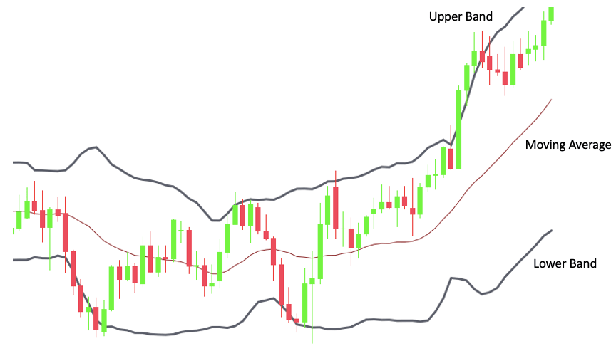
This adaptive mechanism is carried out by placing the bands at a multiple of standard deviation of the same data used for the moving average.
There are many different ways you can use Bollinger Bands®.
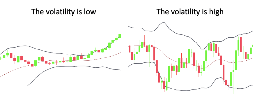
The most obvious is to track volatility. A narrow Bollinger Band® suggests that the price moves in a small range and the volatility is low. Conversely, a wide Bollinger Band® indicates large ranges and a very volatile environment.
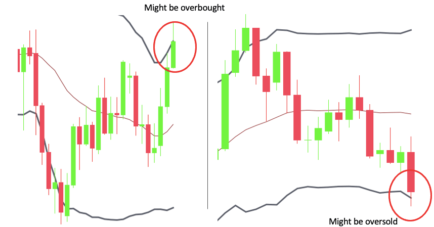
Another fairly common technique is to identify extreme market conditions. When the price touches the upper Bollinger Band®, the move is essentially extended to an extreme territory and indicates a potentially overbought market. This can be regarded as a sell signal. The opposite is true when the price drops to the lower Bollinger Band®.
More complex trading methods include double Bollinger Bands® or Bollinger Bands® used in conjunction with other indicators such as the RSI. We’re going to talk about these later. For now, let’s see how the indicator is calculated.
How to Calculate Bollinger Bands®
As you already know, Bollinger Bands® are volatility bands placed above and below a moving average.
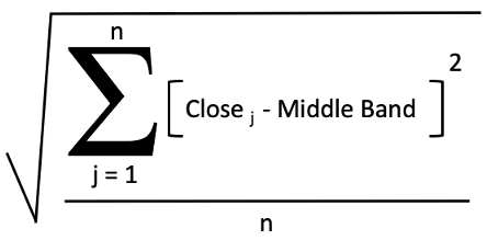
The calculation of the middle band follows the formula of a simple moving average.
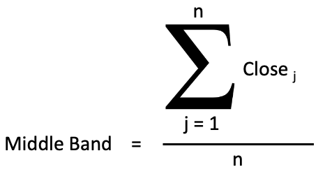
You summarize the closing prices for the past N days and divide this by N. It isn’t very complicated, although the sum symbol might look intimidating when you see it for the first time.
The bottom of the notation indicates the starting point (1), the top shows the finishing point (n), and on the right side, you define the elements being summarized (close in each period).
Here’s an illustration:
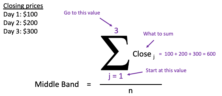
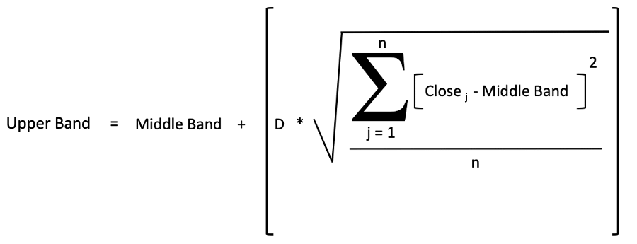
Make sure you understand the sum notation because it’s included in the calculation of the upper and lower bands as well.
Both the upper and lower bands are the same as the middle band, but they are shifted up and down respectively. The degree to which they are shifted is defined by the number of standard deviations that you want to use (i.e. “D”).
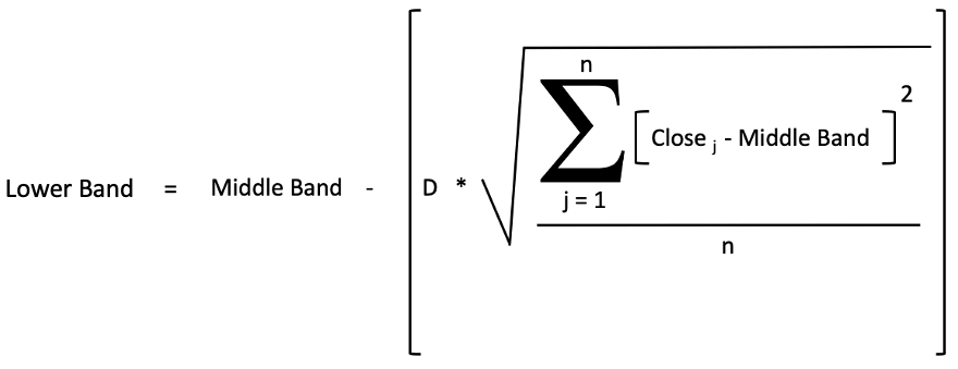
The calculation of the lower band is almost identical, but the same number of standard deviations is being subtracted to shift down the band.
Now you know the Bollinger Bands® formula. At this point, it’s beneficial if you also understand the standard deviation. If you are unfamiliar with the concept, keep on reading. Otherwise, you can skip ahead to the next section and learn how to calculate Bollinger Bands® in Excel.
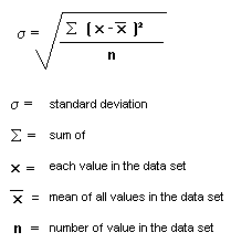
Standard Deviation Explained
The standard deviation shows how an asset’s price differs from the mean value. If the price frequently deviates away from the mean to a significant degree, the asset is considered to be volatile.
In other words, the standard deviation is the measurement of volatility, which, in turn, is used to measure the riskiness of an investment.
The standard deviation can be calculated for a sample or the entire dataset (population). Bollinger Bands® use the population method for which the generic formula looks like this:
The set of numbers is given by the close prices and the mean is given by the middle band. We can rename the variables in the formula accordingly, and this yields the formula that we use in the calculation of the upper and lower bands.
So, what happens here?
First, you subtract the average of the closing prices (the middle band) from each closing price. This will give you a list containing the deviations from the mean – both positive and negative.
The next step would be to figure out how much the standard deviation is.
For that, you must sum the list and divide it by the number of items (n). Here, we run into a problem because the pluses will offset the minuses, so you’ll get a misleading result.
Therefore, you must first get rid of the negative signs by raising the elements to the second power – a negative number multiplied by a negative number is a positive number.At this point, you might notice that while the negative signs are cancelled, we magnified the positive deviations. In other words, we don’t have a standard deviation, we have an average squared deviation.
That’s why you must take the square root as the last step.
Bollinger Bands® Calculation Example (Excel Walkthrough)
Unlike some of the more complicated technical indicators, calculating the Bollinger Bands® in Excel is a rather simple procedure.
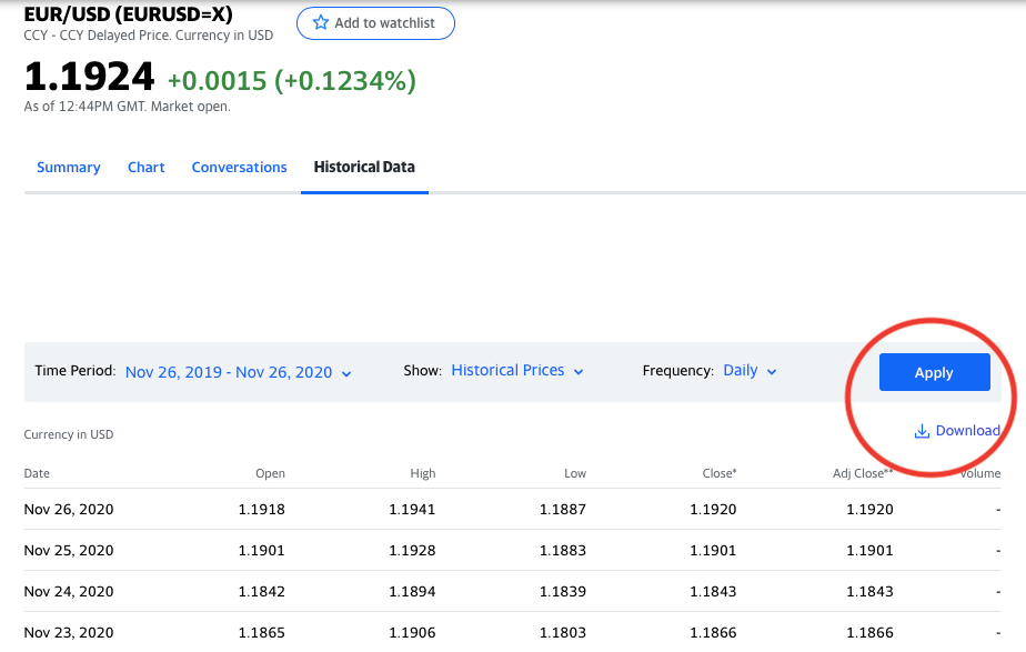
As always, you must start by downloading some data. Go to Yahoo Finance and open the page for EUR/USD. Select the “Historical Data” tab and set the parameters to 1 year of daily data. Then click “Apply” and download the data.
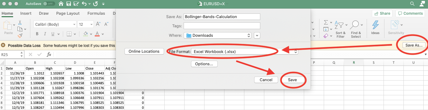
Once you open the spreadsheet, you’ll see a warning message that some features might be lost if you save in the current (.csv) format. To avoid potential issues, just click “save as” and choose the Excel Workbook (.xlsx) format.
Now all you need to calculate the Bollinger Bands® is the “Date” and “Close” data, so you can remove all the redundant columns if you wish. The reason we don’t use “Adjusted Close” is because, for currency pairs, it’s the same as the closing price.
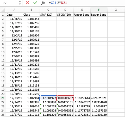
You’re going to be adding four new columns:
- Middle Band: This will be a 20-day simple moving average (SMA)
- Standard Deviation: 20-day standard deviation using the close price
- Upper Band: 20-day SMA + Standard Deviation * 2
- Lower Band: 20-day SMA – Standard Deviation * 2
It’s not complicated, we’re just following the formula. Fortunately, Excel has built-in functions for practically everything we need to calculate, so it will be a piece of cake. 😀
With that said, let’s jump into the example Bollinger Band calculation.
Calculating the Middle Band
Remember that the purpose of the middle band is to provide some measure of central tendency. For traditional Bollinger Bands®, the measure of central tendency is a simple moving average (SMA) using the most recent 20 days.
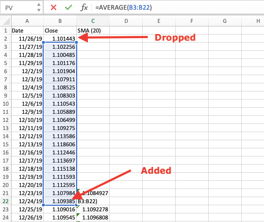
Calculating a 20-day SMA is indeed simple: You must add together the closing prices over the 20-day period and divide the sum by 20. You can use Excel’s AVERAGE() formula and copy down to make it even easier:

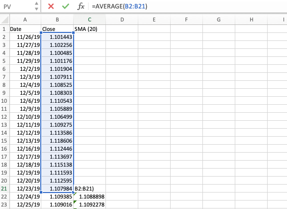
The term “moving” means that, for each period, the average is recalculated adding the new data point and dropping the last.
Of course, if you wanted to use a different period for the moving average, you would give a different range for the AVERAGE() function. The 20-period default was picked because that’s approximately how many trading days there are in a month.
Calculating the 20-day Standard Deviation
If the mathematical standard deviation formula looks difficult, don’t worry, Excel’s formula does the same thing but is more user-friendly.
Don’t forget that Bollinger Bands® use the population method for calculating the standard deviation. The correspondent Excel formula is the STDEVPA(), which expects a set of values as its arguments and returns the standard deviation based on the entire population.
Since we have 20 periods again, you must choose the same range as before and place the formula right next to the first SMA value.
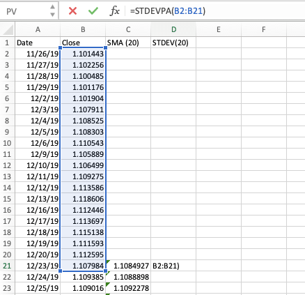
Copy down and you’re ready to move on to calculating the two remaining bands.
Calculating the Upper and Lower Bands
Bands are the same as the middle band, but they are shifted up or down by the number of standard deviations that you want to use. The default “shifting factor” is two standard deviations, so we’re going to stick with that.
As you would expect, the calculations are extremely simple.
For the upper band, you take the middle band and add two standard deviations.
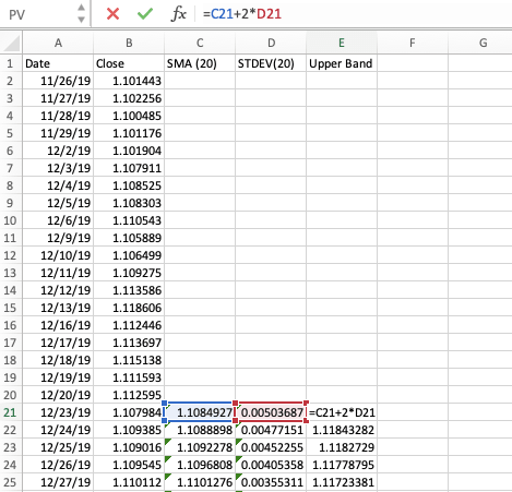
For the lower band, you take the middle band and subtract two standard deviations.
Now, you made the Bollinger Bands® in Excel. Good job! In case you want to go the extra mile, there’s an optional final step.
Visualizing the Bollinger Bands®
You might want to visualize the Bollinger Bands®. Luckily, you already have all the data and it takes only a few clicks to turn the boring numbers into the fancy indicator you can see on any trading platform.
While it’s not technically part of the indicator, let’s start off by making a line chart using the closing prices.
Select the “Close” column, go to “Insert”, and under the recommended charts, choose the line chart.
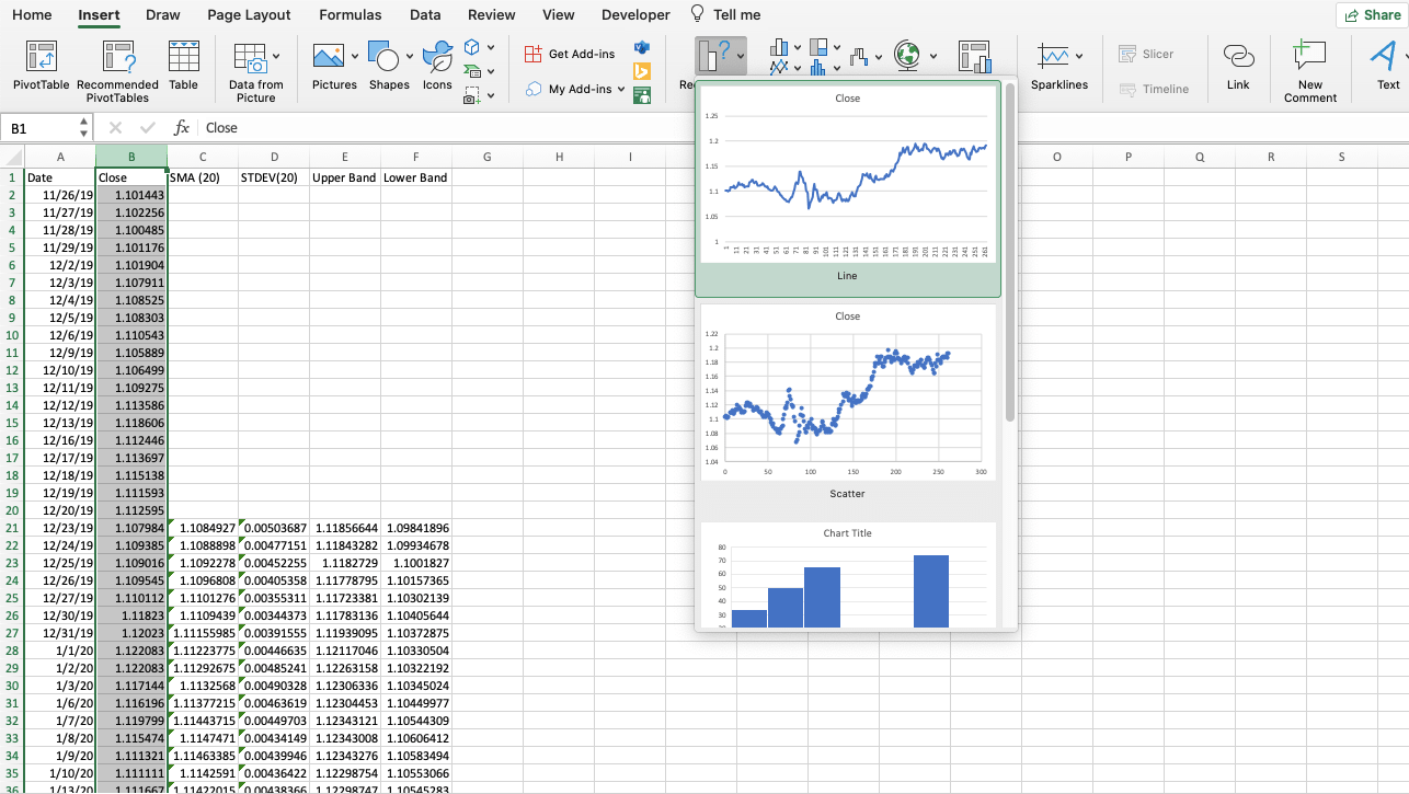
Now, if you take a look at the horizontal axis, you have some weird numbers there instead of the dates. This is because we didn’t specify the data to be used for the horizontal axis, so Excel assigned an index to each value.
To fix this, you must go to “Select Data” and enter the range for the “Date” column in the horizontal axis label box. (Only the actual date values, don’t include the header.)
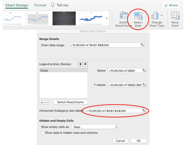
Click “OK” and now you should see the dates on the horizontal axis.
So, we already changed the label, but remember that this is only the price chart. It’s time to apply the Bollinger Bands® indicator by plotting the SMA and the two bands.
You must go back to the “Select Data” window and add three new series: SMA, Upper Band, Lower Band. For each series, select the respective data range, similar to what you did with the dates, but this time, enter into the Y values section.
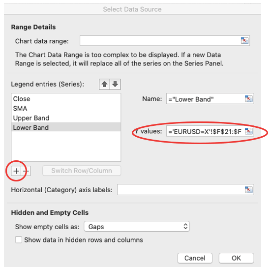
Once you click OK, the indicator is basically up and running.
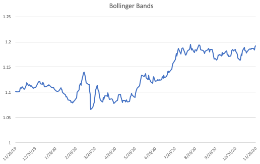
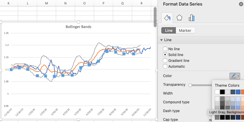
You might want to do a few minor adjustments to make it easier to interpret the bands. First, change the colors to be the same for the upper and lower bands.
Double click on either the lower or upper band and go to the “Format Data Series” tab where you can pick your color from the palette. You can also change the colors for the entire indicator if you wish.
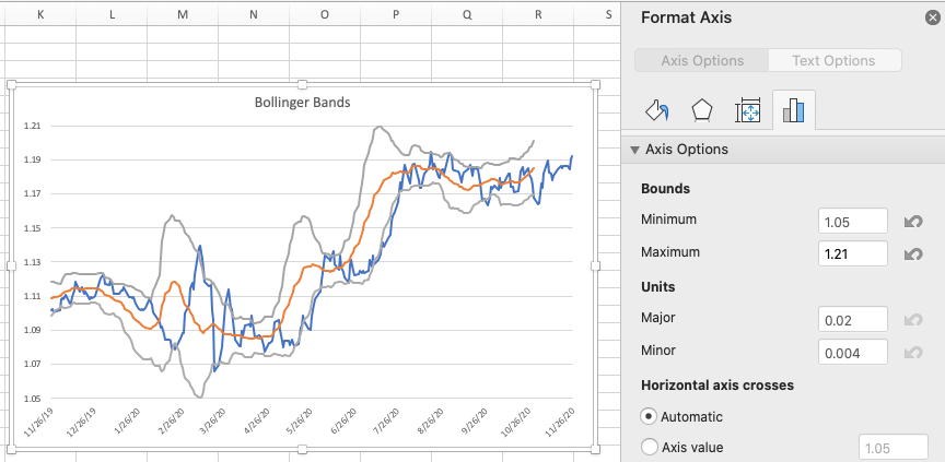
Then, notice that the minimum and maximum values are slightly off from the actual extremes of the indicator. You might want to fix this too. Double-click on the Y-axis values, and on the “Format Axis” panel, set the minimum bounds to 1.05 and the maximum to 1.21.
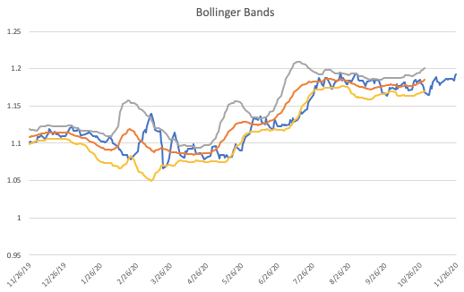
Now, it’s time to compare your Bollinger Bands® with TradingView’s.
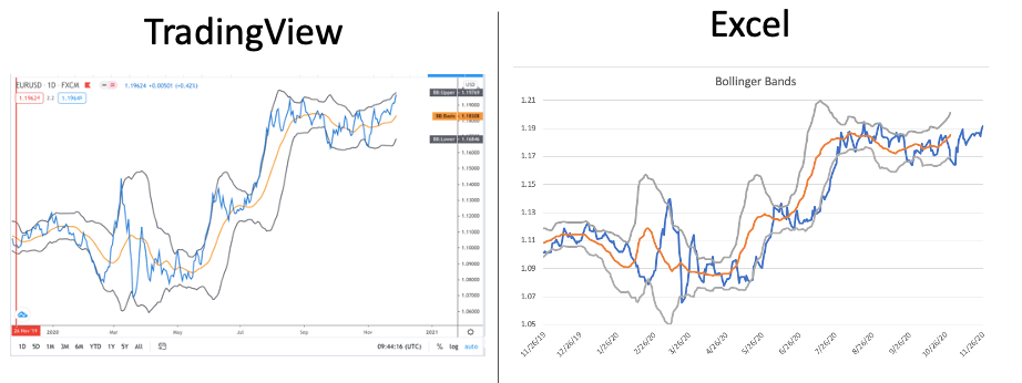
Quite the same! Note that the prices you get from Yahoo Finance might be different as quotes slightly vary from broker to broker. In other words, it’s fine if you don’t have the exact same values. As long as your indicator looks similar, you probably did everything correctly.
How to Use the Bollinger Bands® (Three Popular Ways)
If you are serious about using Bollinger Bands®, you need to get to grips with the main techniques.
We’ve already given you a brief introduction at the beginning of this guide about the basic interpretations of the indicator. But it’s time to get much more specific about how to use Bollinger Bands® in Forex.
In the following section, you’ll learn how to:
- Gauge trends
- Identify M-Tops and W-Bottoms
- Trade the “Squeeze”
All while using Bollinger Bands®.
Let’s get started!
Using Bollinger Bands® to Gauge Trends
Markets normally move in waves as the price tends to follow an alternating pattern of impulse and consolidation.
In an uptrend, buyers keep raising the price, but from time to time, they bump into a level where supply is strong enough to overcome the buying pressure.
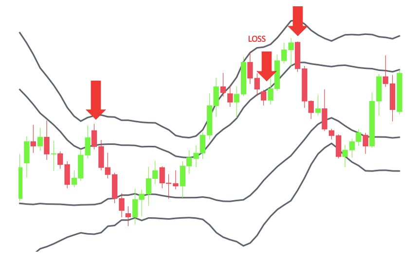
This is where the market enters into a consolidation phase. Shorting when the price breaks above the upper band might make sense if you believe that the market is overbought and due for a pullback.
This idea uses the concept of mean reversion, which states that the price will eventually return to the long-run average. Since the middle band represents the moving average of price, it’s frequently used as a profit target in trades that build on this idea.
Of course, the opposite is true for buying the market if it broke below the lower band and you think a bounce is on the way.
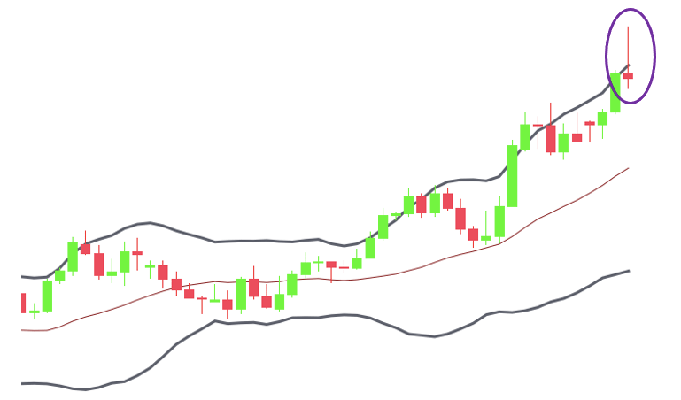
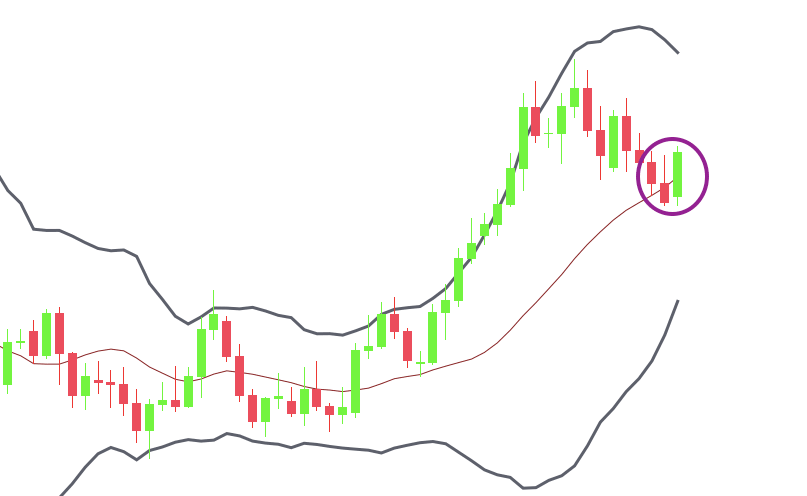
Usually, it helps if you look for other confirmation signals such as support and resistance zones or candlestick formations. For example, below, you can see that the price reaches a major support zone where it crosses the lower band and forms an engulfing pattern.
These confirmatory signals increase the chances that a reversal will indeed happen.
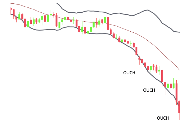
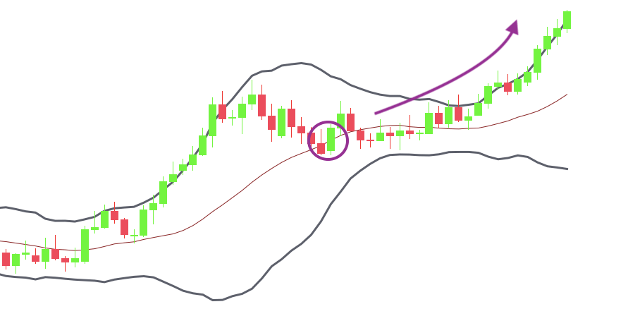
Despite the best efforts, capitalizing on mean reversion can be challenging if the market is trending. Especially on smaller timeframes, unexpected news can quickly spark enthusiasm.
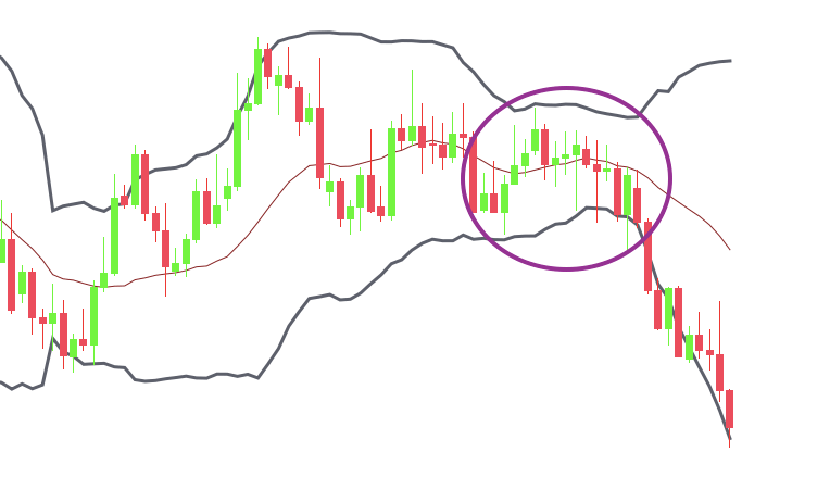
You might find yourself in situations where, instead of reversing, the price is repeatedly pressing into the upper or lower band, indicating an extremely strong trend.
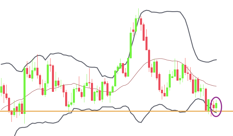
On one hand, you can try to filter out non-trending conditions and only trade mean reversion techniques when a range is in place. In a range-trading environment, look for fairly narrow Bollinger Bands®, ideally in a horizontal formation similar to the chart below:
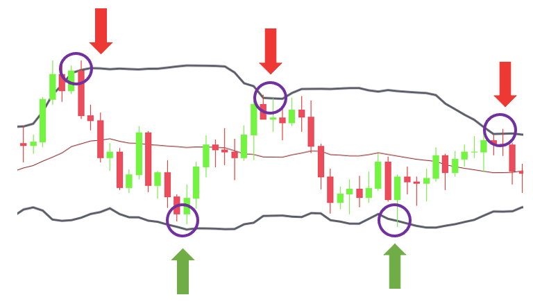
On the other hand, instead of buying and selling when the market breaks the bands, you might wait until the market returns inside the bands and buy or sell somewhere near the middle band.
With this method, you only trade in the direction of the trend, which might not only increase your chances of winning, but you might also benefit from catching a strong trend.
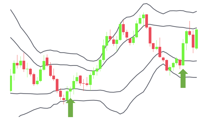
Identifying M-Tops and W-Bottoms
Bollinger Bands® can be a great tool for diagnosing M-tops and W-bottoms.
The designations “M” and “W” are based on Arthur Merrill’s work, who categorized different chart patterns by the sequential order of the points from high to low. He divided these patterns into two categories resembling M and W letters.
Mr. Bollinger is a big advocate of using these M and W patterns in his book, Bollinger on Bollinger Bands.
M-tops and W-bottoms can be regarded as double tops and double bottoms with a common variation being the head and shoulders and inverted head and shoulders patterns.
The idea is that, instead of recognizing these patterns traditionally using trendlines and rigid charting tools, you apply the Bollinger Bands® as a flexible framework for monitoring the formation of the patterns and increasing your forecasting accuracy. Let’s take double, or “M” tops, for instance.
As you might already know from our chart patterns guide, double tops are characterized by:
- a rally (1)
- a pullback (2)
- and a second rally (3) that fails at resistance and breaks through the pullback’s low. (4)
Take a look at the chart below:
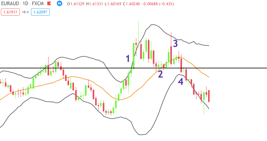
Ideally, you want to see the first top being formed as part of a strong price move (1).
This usually happens when the price breaks through the upper band. If the price does not break through the upper band, the move might not be that impulsive since it couldn’t extend into an extreme territory.
Then, the reaction pullback should take the price back inside the bands, ideally near or beyond the middle band (2). The implication of this is that the rally met with strong resistance and the price was pushed back to its normal level.
The second rally should occur without breaking the upper band (3). This is a warning sign: despite the volatility expansion, buyers couldn’t take the price higher which shows waning momentum and a potential reversal to the downside. Once the price breaks below the retracement low, you get a short signal (4).
Of course, the opposite is true for the double bottom pattern and similar logic can be applied to other patterns.
As a side note, you should typically expect a potential reversal in the swing trend as M-tops and W-bottoms in Bollinger Bands® tend to be smaller variations of the traditional double tops and bottom patterns.
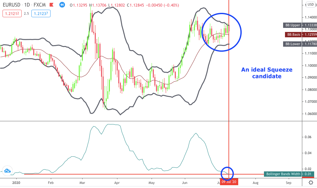
Capturing Breakouts aka Trading “The Squeeze”
Bollinger Bands® are driven by volatility.
When the volatility is decreasing, the Bollinger Bands® are getting narrow. However, when the volatility eventually returns to the market, there’s often a robust breakout from the bands. Traders frequently call this phenomenon the “Squeeze”.
Lots of people try to capture the breakout. If you want to be one of them, you need to be aware of a few things.
The obvious first step is to wait for a consolidation in which the trading range narrows dramatically. You want to see the moving average flattening and the Bollinger Bands® tightening around the price.
According to Bollinger, the Squeeze setup is identified when the volatility reaches a six-month low value. If you trade lower than the daily, you might translate this to a more relevant time period. This is just our suggestion.
For example, six weeks for the four-hour chart or something similar if you feel that the six-month low is a bit too much.
The way you can measure volatility is through the BandWidth.
John Bollinger developed a BandWidth indicator that we’ll address later. However, you can also rely on your eyes if you wish. Either way, your job is to take notice when low volatility conditions occur and take action based on your rules.
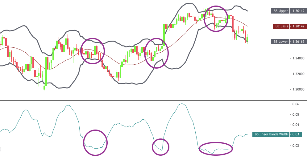
Unfortunately, the Squeeze setup only identifies typical breakout conditions, but it doesn’t say anything about the breakout direction. This is something you have to identify yourself using other tools such as the relative strength index or other indicators.
Double Bollinger Bands® Trading Strategy for Picking Tops and Bottoms
Now you have an idea about how to use the Bollinger Bands®. It’s time to take things one step further and dive into an exact trading strategy.
This double Bollinger Bands® strategy is featured in Kathy Lien’s Day Trading and Swing Trading the Currency Market. Kathy is a prominent figure in the Forex trading world, you can check out her profile on Investopedia and the book is available at various online retailers.
The strategy – as you’d expect – uses two Bollinger Bands®, so it’s going to be a bit more advanced.
First, we’re going to tell you the setup quickly. Then, we’re going to talk about how to use the strategy to pick market tops and bottoms.
The Strategy Setup
Add the Bollinger Bands® indicator to your chart and leave the standard-deviation on the default two. Remove the middle band if your charting platform allows you to do that.
Repeat the step above but change the standard deviation to one.
Once you finish, you’ll have four bands on the chart. The outer lines are the two-standard-deviation Bollinger Bands®, and the inner lines are the one-standard-deviation Bollinger Bands®.
This is the setup you need for this strategy.
The Rules
As we already mentioned, one common way to use the Bollinger Bands® is to gauge the trend and identity potentially overbought or oversold situations.
If the currency pair rises to the upper Bollinger Band, it might be overbought because the move extended to an extreme level and a consolidation may occur. Similarly, the idea is the same when it drops to the lower Bollinger Band.
The problem with this approach is that strong trending markets can cause you significant losses as the price might be above or below the Bollinger Band for a long time before finally turning around.
We also talked about this issue earlier and suggested a few possible solutions such as using other indicators for confirmation or taking signals in trend-direction only. Another approach is offered by Kathy, who recommends adding another set of Bollinger Bands®—the 20- period, one-standard-deviation.
You already did this, so let’s see how to use double Bollinger Bands® to pick tops and bottoms.
To quote the author:
“The general rule of thumb is that we don’t buy a bottom until the currency pair has traded above the first standard deviation Bollinger Band. Along the same lines, we do not sell a top until the pair trades below the first standard deviation Bollinger Band.”
Let’s see what it looks like in action:
| Long Trade | Short Trade | |
| Situation | The price is between the lower first and second standard deviation Bollinger Bands®. | The price is between the upper first and second standard deviation Bollinger Bands®. |
| Signal | A candle closes above the first standard deviation Bollinger Band® | A candle closes below the first standard deviation Bollinger Band® |
| Stop | 50 pips below the first standard deviation Bollinger Band® | 30 pips above the first standard deviation Bollinger Band® |
| Targets | Two targets: 1) Close half of your position when the market moves by the risked amount. Move the stop on the rest to breakeven. 2) Target two times risk for the remaining position. | Two targets: 1) Close half of your position when the market moves by the risked amount. Move the stop on the rest to breakeven. 2) Target two times risk for the remaining position. |
Long Trade
For long trades, you must look for currency pairs that are trading between the lower first and second standard deviation Bollinger Bands®.
The buy signal occurs when a candle closes above the first standard deviation Bollinger Band.
You might buy immediately at close, or 5 PM New York time. Not talked about in the strategy, but you might also use a pending order slightly above the close. This way, you only enter if the market moves a bit more in your direction as an additional bit of confirmation that a reversal might be on the way.
The recommended stop placement is 50 pips below the first standard deviation Bollinger Band. If you need more ideas on placing your stop loss, download our free PDF guide.
As for targets, you should have two target prices in mind.
The first target is reached when the market moves in your direction by the risked amount. In this case, close half of your position and move the stop to breakeven on the rest.
The second target is reached when the market keeps moving in your direction and reaches two times risk. At this point, you can close or trail the stop even further if you wish.
Short Trade
A similar procedure goes for short trades.
You must look for currency pairs that are trading between the upper first and second standard deviation Bollinger Bands®.
Sell at close below the first standard deviation Bollinger Band and place your stop 30 pips above the first standard deviation Band.
The rules for successful exits are the same as for a long trade. That is, close half of your position when the market moves by the risked amount. Then, move the stop to breakeven and target two times risk for the remainder of your position.
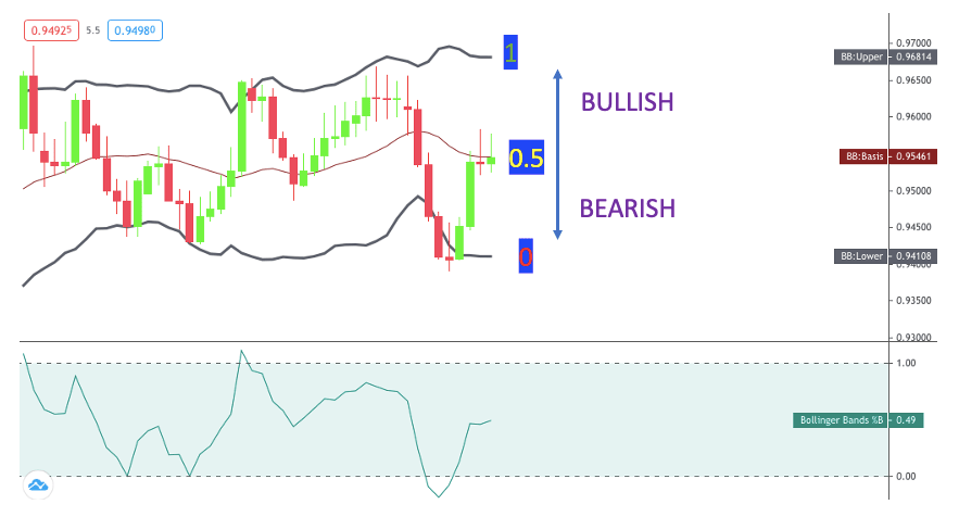
What is the Bollinger Band %B?
The %B indicator is a supplementary tool to the Bollinger Bands® developed by John Bollinger to depict where the price is in relation to the upper and lower bands. The main purpose is to help you program mechanical trading systems by making it easier to compare the Bollinger Bands® with other indicators.
The formula looks like this:
%B = (Price – Lower Band)/(Upper Band – Lower Band)
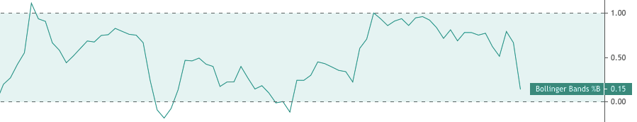
Despite the name, the values aren’t translated to percentages, but it’s easy to see that 0.15 is the same as 15% and so on.
In terms of reading the indicator, the SMA acts as the watershed between bullish and bearishness. At this level, the %B shows 0.5 because the price is right between the upper and lower bands.
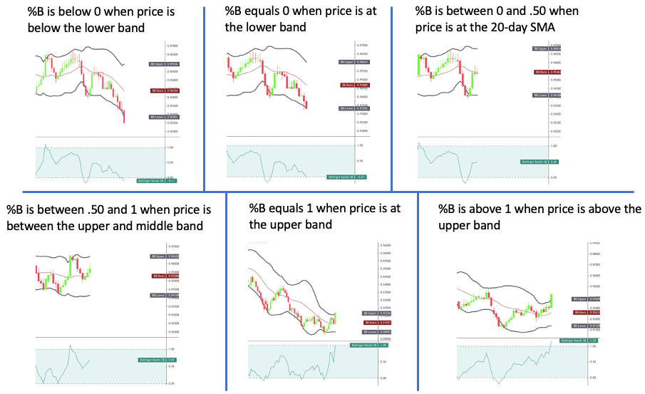
Any price above the SMA will turn the %B greater than 0.5. It will reach 1 at the upper band and go beyond if the price keeps rising. Conversely, prices below the SMA will result in a %B smaller than 0.5. It will reach 0 when the price is at the lower band and go below when the price is below the lower band.
Here’s a more detailed visual summary for your convenience:
As Bollinger says, it allows for all sorts of relative comparisons. For example, you can write a program that sells if %B is greater than 1, but the RSI is turning down at 80.
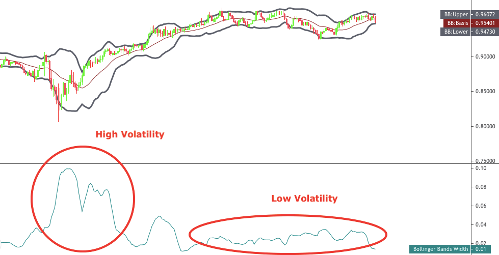
Interpreting the BandWidth Indicator
Just like the %B, the BandWidth indicator is also derived from the Bollinger Bands® and developed by John Bollinger. It’s used to depict volatility and to help identify the Squeeze setup. You can also use it to identify the beginning and end of trends.
During a period of low volatility, the distance between the two Bollinger Bands® will contract and the BandWidth will decrease accordingly. On the other hand, during a period of high volatility, the distance between the two bands will widen and the BandWidth will increase.
At any point, you can get the exact BandWidth values by subtracting the lower band from the upper band and then dividing it by the middle band, as shown in the formula:
(Upper Band – Lower Band) / Middle Band (SMA)
According to Bollinger, the BandWidth is most useful for identifying the Squeeze. This is a situation when volatility is so low that you can basically take it as a forecast of increased volatility and a subsequent breakout from the trading range.
Bollinger recommends looking for the BandWidth to show a six-month low reading, but you might adjust this depending on your preferences.
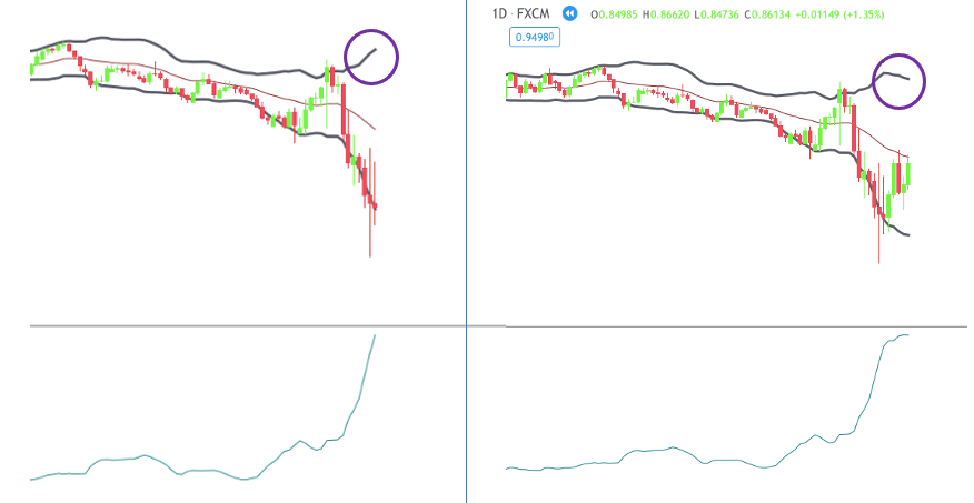
Another way to use the BandWidth is to mark the beginning and end of trends.
Many trends emerge from trading ranges when the BandWidth is narrow. A breakout from the range accompanied by a sharp expansion in BandWidth indicates a potential for a new trend.
On the flip side, when the BandWidth is wide, the volatility is significantly expanded, and the trend might be near to its end.
For this, the idea is to look for situations when the band on the other side of the trend heads in the opposite direction to the trend. You want to see the BandWidth flattening out or turning down enough to reverse the direction of the Bollinger Band on the opposite side of the trend. Then, you can take it as a signal that a correction or potential reversal is on the way.
Conclusion
Bollinger Bands® are very powerful tools to speculate about the market.
You can use them to gauge trends, find turning points, or simply to determine whether the market is volatile or not.
However, there are two sides to this coin.
In your quest to make money, you may come across plenty of losing signals. That’s why you must combine Bollinger Bands with other tools and use them in the context of a broader trading plan that will help you achieve your goals.