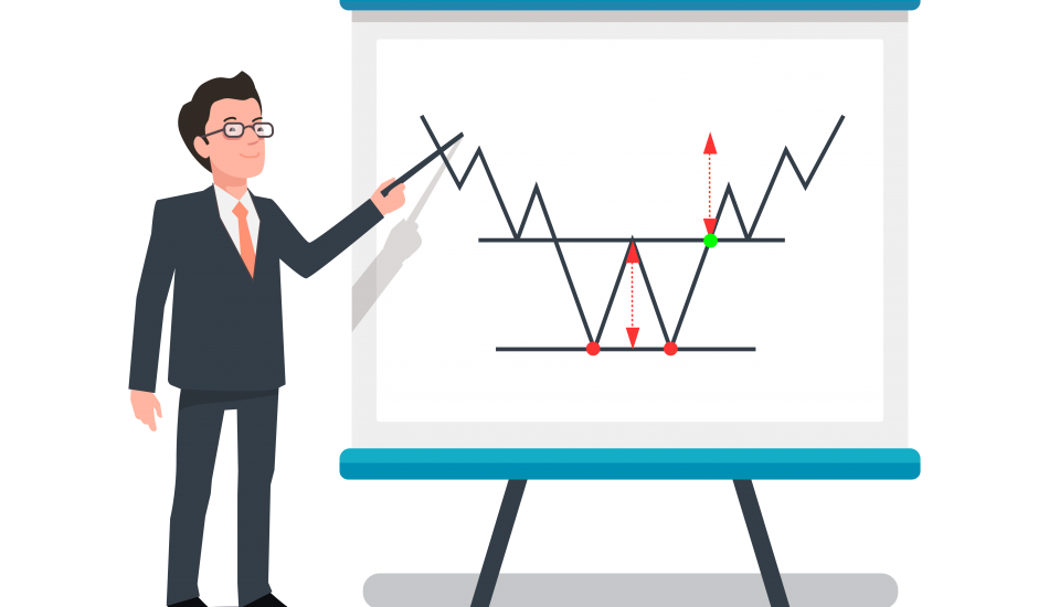
Even if you’re new to forex, you’ve probably heard about chart patterns.
Forex chart patterns are patterns in past prices that are supposed to hint at future trends. There are many different patterns, with various suggestions depending on the situation.
In this guide, you’ll learn how to read these patterns. We’ll also look at their role in designing a trading system.
Before we get started, download a copy of our forex chart patterns cheat sheet. It’s completely free and it has everything from definitions to practical examples.
The guide is structured as follows:
First, we explain the notion of forex chart patterns:
- What is a forex chart pattern?
- Why do chart patterns occur?
- Are chart patterns reliable?
- How do you use chart patterns in forex?
Then, we’ll show you popular forex patterns and explain them one by one.
These patterns are highlighted below for a quick overview. Each pattern is discussed in detail later in the guide.
Name | Typical suggestion | Short description | Appearance |
Double top | End of an uptrend | A pattern consisting of two peaks that are located at roughly similar levels. | 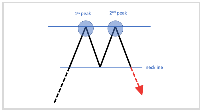 |
Double bottom | End of a downtrend | A pattern consisting of two bottoms that are located at roughly similar levels. | 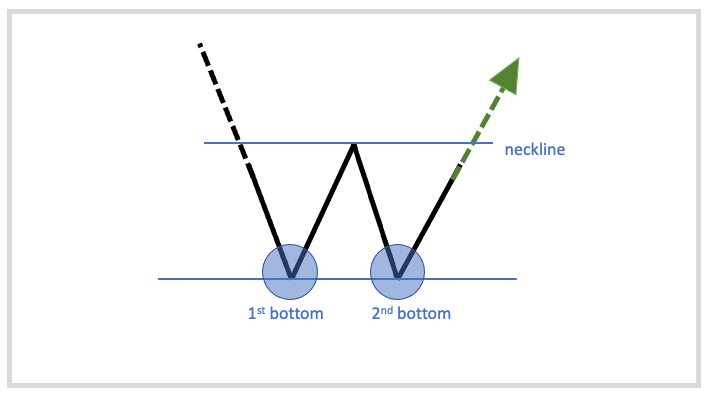 |
Head and shoulders | End of an uptrend | A pattern consisting of three peaks, with the middle peak being taller than the others. | 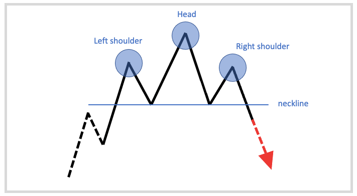 |
Inverse head and shoulders | End of a downtrend | A pattern consisting of three valleys, with the middle valley being lower than the others. | 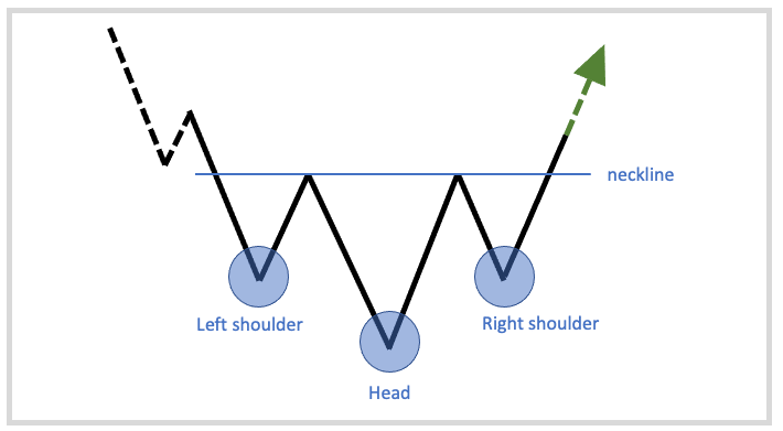 |
Rising wedge | End of an uptrend or continuation of a downtrend | A pattern consisting of two up-sloping trend lines that consciously narrow as the market moves higher. | 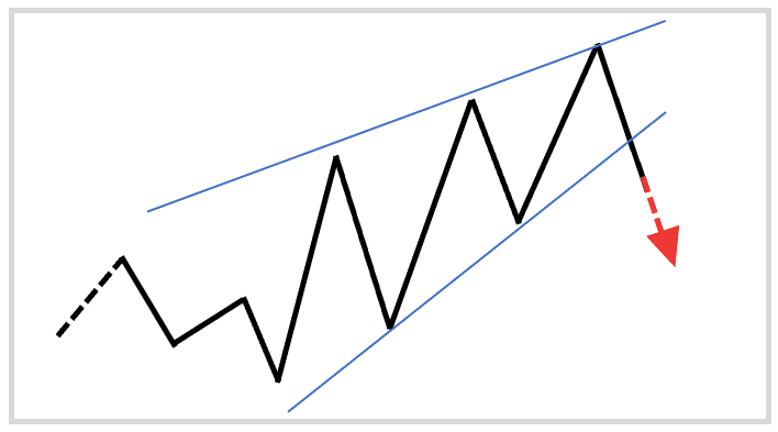 |
Falling wedge | End of a downtrend or continuation of an uptrend | A pattern consisting of two down-sloping trend lines that consciously narrow as the market moves lower. | 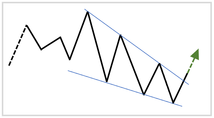 |
Bullish flag | Continuation of an uptrend | A pattern consisting of a large price increase and a subsequent consolidation bounded by two parallel trend lines that point down. | 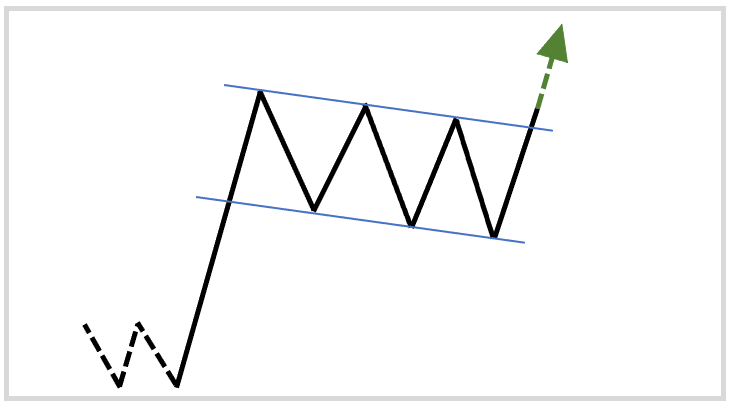 |
Bearish flag | Continuation of a downtrend | A pattern consisting of a large price drop and a subsequent consolidation bounded by two parallel trend lines that point up. | 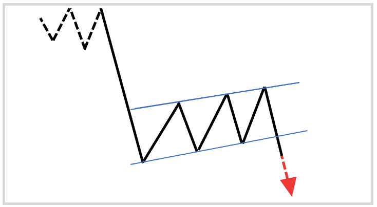 |
Bullish pennant | Continuation of an uptrend | A pattern consisting of two converging trend lines. | 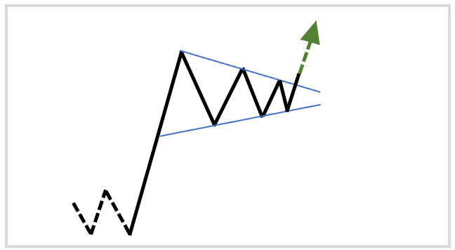 |
Bearish pennant | Continuation of a downtrend | A pattern consisting of two converging trend lines. | 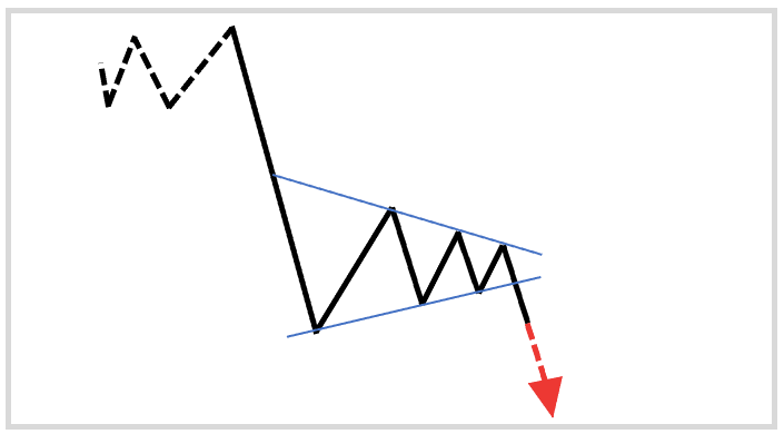 |
Ascending triangle | Continuation of an uptrend | A pattern consisting of a horizontal top and an up-sloping bottom. | 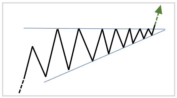 |
Descending triangle | Continuation of a downtrend | A pattern consisting of a horizontal bottom and a down-sloping top. | 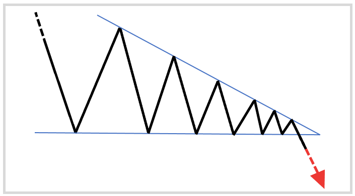 |
Bullish rectangle | End of a downtrend or continuation of an uptrend | A pattern consisting of two horizontal trendlines between which the price oscillates. | 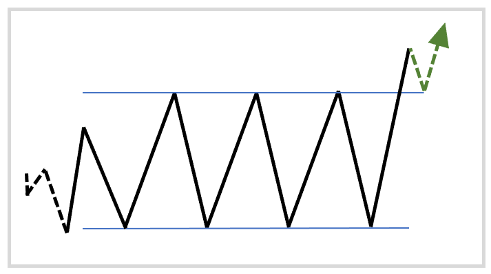 |
Bearish rectangle | End of an uptrend or continuation of a downtrend | A pattern consisting of two horizontal trendlines between which the price oscillates. | 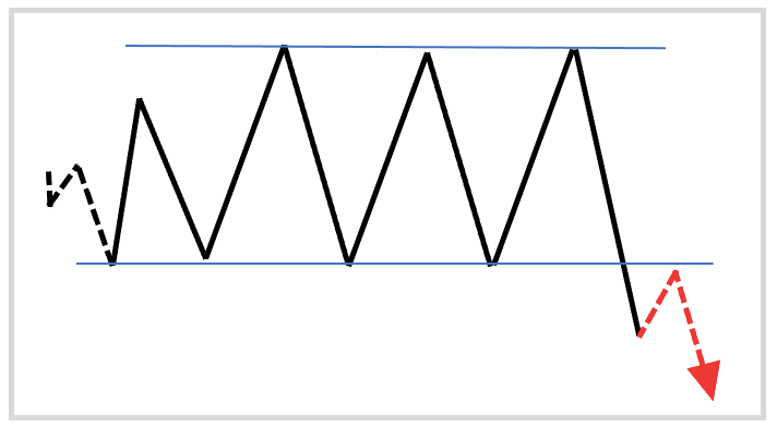 |
What Is a Forex Chart Pattern?
Forex chart patterns are patterns in historical price data that can indicate when there is a greater probability of one thing happening over another.
Many people believe that prices evolve randomly and that there is no way to predict the future. Those who subscribe to this hypothesis avoid trading and invest in index funds.
Others believe that prices are at least somewhat predictable. Those who belong to this group want to beat the market through fundamental analysis, technical analysis, or the combination of the two.
Fundamental analysis uses financial data such as GDP reports or expectations of future interest rates to determine proper exchange rates. Technical analysis assumes that “history repeats itself” and that past price behavior is indicative of future price behavior.
Thus, while fundamental analysts rely on economic data, technical analysts examine patterns of past price behavior.
Some forex patterns relate to only one or a few price bars. These are called candlestick patterns and not chart patterns. The distinguishing feature of chart patterns is that they take a long time to form and consist of several price bars.
In their book, Technical Analysis of Stock Trends, Robert D. Edwards and John Magee were the first to provide a systematic overview of the most commonly recognized chart patterns.
Since then, countless books, YouTube videos, and websites have talked about chart patterns.The idea is that if you can develop an understanding of various forex chart patterns, you can become a better trader.
Why Do Chart Patterns Occur?
Chart patterns occur because people behave in similar ways as they did in the past.
Let’s dig a bit deeper.
The traditional academic view has always centered on the notion that investors are rational and market prices properly reflect whatever information is available to them.
This suggests that regardless of how high or low the price is, it must be the correct price based on currently available information.
Now, here we run into a problem—at least as far as chart patterns are concerned. If currently available information is already priced in, only new information can cause price changes.

How could past price data help you predict the future if the market reacts only to new information, which is obviously unpredictable?
Some say you can’t, and you should invest in passive index funds instead. These people are the proponents of the economic theory referred to as the efficient market hypothesis (EMH), introduced by Fama.
A relatively new school of thought called “behavioral finance” has a different perspective. Behavioral finance argues that people are not always rational, and their decisions are subject to various biases.
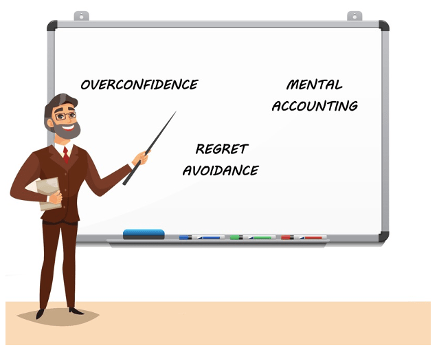
You can probably recall situations when you threw your analysis through the window and acted based on your feelings. Perhaps you were afraid of missing out on an opportunity or you held on to your losing position for too long.
Irrationalities like these happen all the time because emotions such as fear and greed prompt people to do crazy things.Now, if people are consistently influenced by their emotions, it is logical to expect that some patterns are observable on price charts and repeat themselves around important psychological areas.
This last point is important. You can find chart patterns on any chart, but chart patterns at important psychological levels are more meaningful.
Are Chart Patterns Reliable?
Unfortunately, this question is hard to answer with a simple yes or no.
Even the simplest forex chart pattern can be incorporated into many different trading strategies in many different ways, resulting in different profit/loss profiles.
It is safe to assume that your ultimate trading system will influence your success with chart patterns. Chart patterns alone will get you into more trouble than they are worth.
Just think about it:
How difficult was it to find this article about chart patterns? Chances are, it took only a simple Google search. This is because chart patterns are publicly available information. They are easy and costless to obtain.
If forex chart patterns were very reliable, every market participant would closely monitor them. Once a signal was present, the market would be flooded with orders and the price would immediately rise or fall to the foreshadowed rate.
On the one hand, this is clearly not the case. On the other hand, even if it was, it wouldn’t do much good for you.
You might have an outstanding internet connection, but good luck beating the speed of Wall Street firms that spend millions of dollars on things like smart routers, algorithms, and high-speed connections to exchanges.

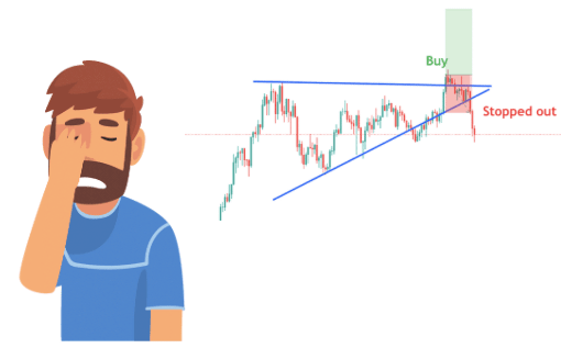
The reason chart patterns don’t evoke dramatic interest from traders is that their reliability is far from obvious. You can find just as many failed patterns as successful ones.
On top of that, chart patterns are subjective. Though there are guidelines for identifying them, “textbook examples” are rare in the real world and there is always room for interpretation.
The psychological forces that are supposed to form these patterns also require time to play out. Patterns on higher charts such as the daily might be more meaningful than intraday patterns.
For instance, let’s say the EUR/USD has been trying to break above the 1.20 level for months, and by doing so it slowly prints out a bearish reversal pattern.
You can be sure that most market participants closely monitor the 1.20 level for various reasons:
- If the euro appreciates above 1.20, US companies might delay projects in Europe, as they might no longer be profitable under the expensive euro.
- Hedge funds might begin purchasing EUR and selling USD.
- European exporters such as Mercedes might worry that their products will not sell abroad if the EUR strengthens.
The point is that a lot of market interest is clustering around a particular level. You know this because the market is hovering around that level for a long time.
Therefore, a pattern formed at this higher timeframe is more likely to reveal useful insights regarding market dynamics than the same pattern formed on intraday charts.Besides, spotting a pattern is just the beginning. What you do next will have a profound impact on your results as well as your perception of the reliability of chart patterns.
How to Use Chart Patterns in Forex
Chart patterns can serve as a basis for a wide variety of trading systems. They can help you carve out an edge over the market and make money in forex.
While they are no silver bullet, they provide some information, which is better than having no information.
Chart patterns are often simple formations such as two failed attempts to achieve a new high price. It doesn’t require much imagination to see that this might be a bad sign.
That said, you can’t take a pattern like that at its face value because any implication is highly contextual.

- What is the timeframe? – A pattern spotted on the daily chart carries more meaning than a pattern on the 5-minutes chart.
- Are other negative factors accompanying the pattern? – The market might simply be consolidating.
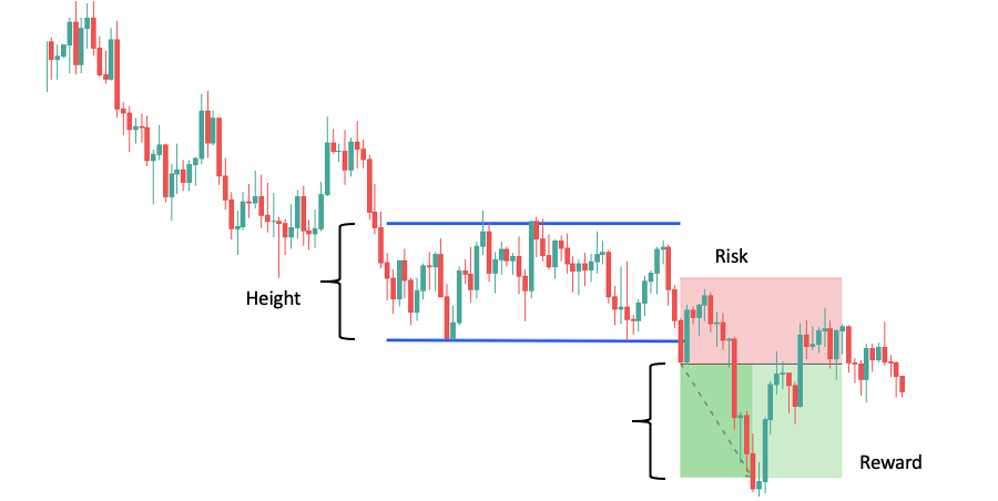
- How does the risk relate to the potential reward? – Is it even worth opening a trade?
- Are important news releases scheduled? – They might change the trading landscape, especially on smaller charts.
Successful trading systems that incorporate chart patterns also account for a variety of factors. We recommend that you bookmark our guides on how to create a trading strategy and how to create a trading plan.
That way, you can read them later, when you are finished with this article.
You can also download our forex chart patterns cheat sheet (if you haven’t already) to help you whenever you are in doubt regarding a pattern.
Common Chart Patterns (In No Particular Order)
Now that you know the basics of chart patterns, it’s time to look at the most common forex patterns!
A few notes before we get started:
Entry and exit points
With each chart pattern, you can use the formation height and add it to the breakout price to get the profit target. We’ll show you examples so that you see how it works. We’ll also show you where we would place our stops.
We’ll ignore volume
Stock traders usually consider volume to be an important factor in identifying chart patterns. They look at how volume changes during the formation of the pattern, and might reject or favor set-ups based on that.
While this is fine, the forex market is decentralized. This means that whatever volume data you have, it relates to only a small portion of the market (such as volume at your broker) and might not represent the entire market.
Therefore, although there are ways to use volume in forex, we’ll ignore volume in this guide.
An art, not a science
Chart patterns are subjective, meaning that different traders might do and interpret things differently. For example, someone might draw trendlines using wicks, while someone else might use closing prices.
Instead of worrying about every little detail, focus on what certain formations reveal about the balance between buyers and sellers.
It’s like when you’re working out. The muscle doesn’t know your training program; it just responds to stimulus. Sometimes you have to be more flexible and throw in some extra reps or rest a bit more.
The same goes for chart patterns. We’re not saying to break your trading plan but leave yourself more flexibility when it comes to chart patterns. Every situation will be slightly different, which is fine.
With that said, let’s see forex patterns in detail.
Double Top
The double top is one of the simplest patterns on charts. It occurs at the top of uptrends and has a typical “M” shape that even beginners can easily recognize.

How to read the pattern:
When the price reaches a new high, it shows conviction behind the uptrend. Each trend alternates between impulse and consolidation moves, so the correction following the high is to be expected.
The situation turns interesting when the price resumes its trend and reaches the high again. Instead of breaking through and putting in another higher high, the buying pressure evaporates and the price is unable to surpass its previous high.
As you might know, uptrends are characterized by higher highs and higher lows.
When the price fails to break above the prior high, it breaks the pattern of an uptrend and signals possible weakness. Perhaps it will take a bit more time for buyers to attain a new high or perhaps sellers are about to take control.
At this point, you don’t have enough information to make a trade decision.
Shortly, the price drops just like the first time, but now it breaks below the previous pullback’s low. You can assume that sellers are strong enough to reverse the trend or at least drive the market into an extended consolidation.
Both cases can be a good set-up for a short trade.
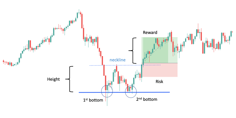
The pullback low is often marked with a line called the “neckline”. The double top pattern is completed when the neckline breaks. Traders often set a profit target by measuring the distance between the neckline and the high of the pattern and projecting it to the neckline break.
You’ll find an example below:
This guide belongs to ForexSpringboard.com. Do not copy without permission.
Double Bottom
The double bottom is the mirror image of the double top. It occurs at the bottom of downtrends and has a typical “W” shape.

How to read the pattern:
When the price reaches a new low, it shows conviction behind the downtrend. As we have pointed out, trends consist of impulse and consolidation moves. Thus, it’s normal for the price to temporarily rise after a new low forms.
The situation turns interesting when the price resumes its trend and reaches the low again. You’d expect the market to put in another lower low, but instead, the selling pressure evaporates and the price is unable to surpass its previous low.
This is problematic because the downtrend should follow the pattern of lower highs and lower lows.
When the price fails to break below the prior low, it signals a possible issue with the trend. That said, this is not yet a buy signal.
The buy signal comes when the price rises again, but this time it breaks above the previous pullback’s high. Now you can assume that buyers are strong enough to reverse the trend or at least drive the market into an extended consolidation.
In both cases, you can favor a long trade.
The pullback low is often marked with a line called the “neckline”. The double bottom pattern is completed when the neckline breaks. Traders often set a profit target by measuring the distance between the neckline and the low of the pattern and projecting it to the neckline break.
You’ll find an example of a successful double bottom trade below:
Do you want to learn more about trading reversals with double top and double bottom forex patterns? Take a look at this guide
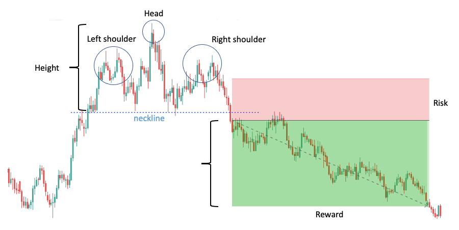
Head and Shoulders
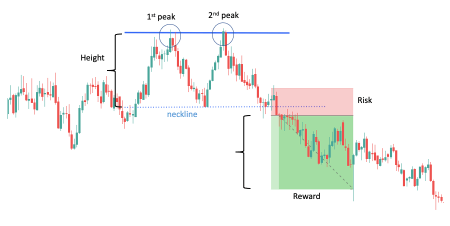
The head and shoulders pattern is a fairly complex formation consisting of three peaks, with the center peak being the highest of the three. You’ll find this pattern at the top of uptrends, and it predicts a trend reversal.

How to read the pattern:
Let’s break down each stage of the pattern step by step so that you can easily follow along:
- The market has been rising steadily for some time when the price hits a peak and begins a short consolidation. This forms the left shoulder.
- From the low point of the left shoulder, the bullish advance continues and significantly surpasses the previous high. After some time, the price reaches a new peak and now enters a more prolonged consolidation. This forms the head.
- A final advance from the low of the head starts but it quickly fails, and the market turns down. This forms the right shoulder. The right shoulder is lower than the head and roughly in line with the left shoulder.
- The pattern is completed when the price breaks below the neckline, which is the line connecting the low of the shoulders.
The neckline can slope in any direction and is a good predictor of the severity of the price decline. You can project the height of the pattern to the neckline break and set your profit target accordingly.
An example of a successful head and shoulder set-up is shown below:
For a beginner trader, the head and shoulders pattern might be more difficult to recognize. You can always zoom out a bit from the price action or switch to a line chart.
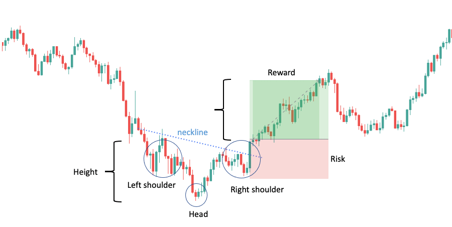
Inverse Head and Shoulders
The inverse head and shoulders pattern is the bearish equivalent of the head and shoulders. It can be found at the bottom of downtrends and indicates a bearish-to-bullish trend reversal.

How to read the pattern:
- Following a falling market, the price bumps into a bottom and then rises to form the left shoulder.
- From the high of the left shoulder, a bearish decline starts. It progresses significantly below the previous low to form the head of the pattern. Then the price begins to rise again.
- A final decline from the high of the head starts to form the right shoulder. This trough is higher than the head and about equal to the bottom of the left shoulder.
- From the bottom of the right shoulder, the price starts to rise again. Once it breaks above the connected high points of the pullbacks (neckline), the pattern is complete.
Below are an example of a winning inverse head and shoulder set-up:
We have a separate guide on Head and Shoulders patterns that you can access via this link if you want to learn more about them.
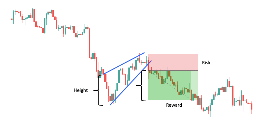
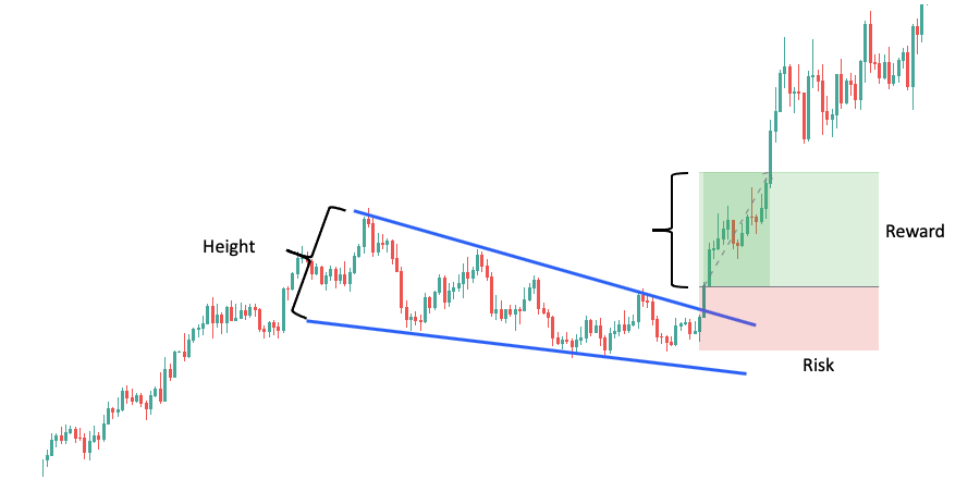
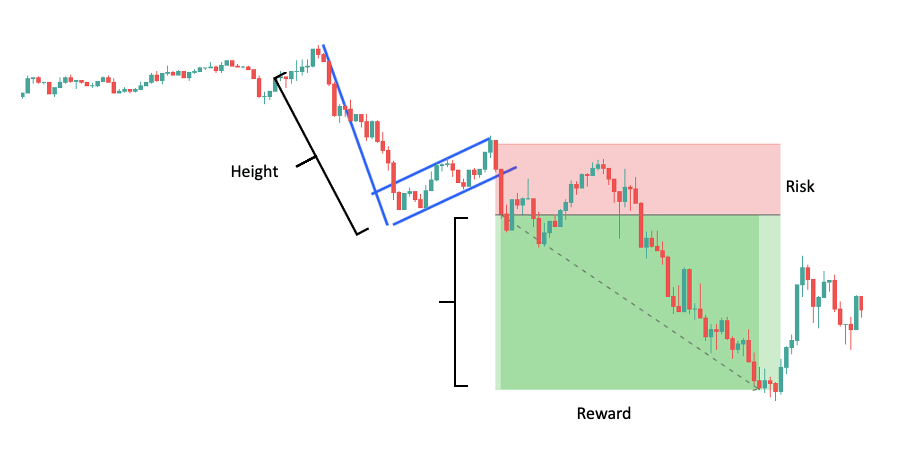
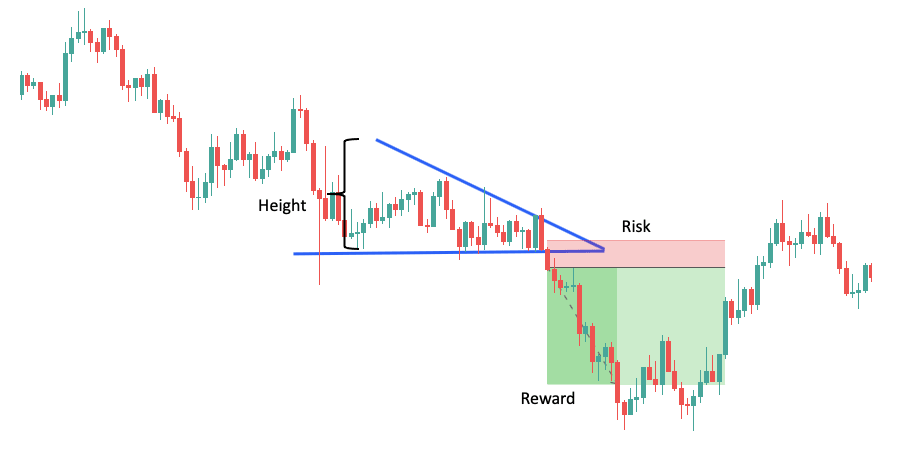
Rising Wedge
The rising wedge pattern forms when the market makes higher highs and higher lows within a shrinking range that slopes upward.

This pattern is trickier than those we have discussed so far because its signal depends on the trend. That is, a rising wedge in an uptrend signals reversal while a rising wedge in a downtrend signals continuation.
Let’s break it down so that it makes sense:
How to read the pattern (in an uptrend):
Whenever you spot a rising wedge in an uptrend, it’s a sign of investor enthusiasm. The price makes higher highs and higher lows, which fulfills the characteristics of a healthy uptrend.
The reason the rising wedge acts as a reversal signal despite being indicative of a strong trend is the extent of the price increase.
If you take a closer look at the pattern, you will notice that the lower trendline rises at a steeper angle. While the market keeps reaching higher highs, the subsequent consolidations are shorter and shorter.
This happens when investors are so enthusiastic that every time the market dips, they rush to buy and immediately bid up the price.
Unfortunately, this can go on for only so long before the interest dries up and the market collapses.
Every trend has a point where everybody who wanted to buy has already bought. This is when short-selling intensifies and the market begins ticking down. Thus, people cash out on their long positions, which further fuels the downward pressure.
The rising wedge marks this turning point and allows you to position yourself accordingly.
The example below will illustrate:
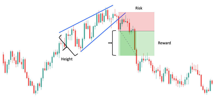
How to read the pattern (in a downtrend):
The rising wedge in a downtrend is created by the same overconfident buyers, except that this time the market is in a downtrend.
Each time the market begins consolidating after a drop, traders are speculating on a reversal. If these traders are in the majority, the market can indeed reverse. However, “contrarian” traders can gain the upper hand, despite being in the minority.
The reason for this is fairly simple.
You probably wouldn’t short a market after a significant drop. There is no reason to risk getting stopped out by the imminent correction. It makes more sense to wait until the correction occurs and enter at a better price.
When enough traders think this way, the selling pressure will ease, allowing buyers to bid up the price. When buyers finally run out of steam, however, all the traders sitting on the sidelines will flock to the market with their shorts.
This is why the rising wedge suggests continuation in a downtrend. It marks the point where the bull run fails, and sellers force the market back into trend.
Here is an example:
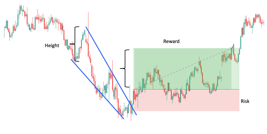
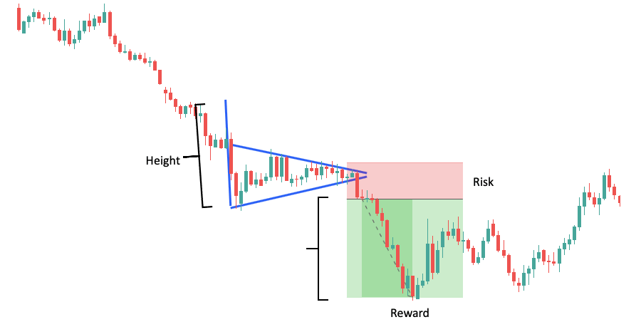
Falling Wedge
The falling wedge pattern forms when the market makes lower highs and lower lows within a shrinking range that slants downward.

Not surprisingly, it’s the mirror image of the rising wedge.
As the price moves to the downside, the two trendlines that connect the highs and the lows will eventually converge.
At the end of the falling wedge pattern, you’ll see that the price fails to make a new low and breaks through to the upside. This suggests continuation if the trend is up, or reversal if the trend is down.
Let’s take a closer look at these two situations.
How to read the pattern (in an uptrend):
Often, after a new high is reached, the market will enter a period of consolidation. The falling wedge forms when this temporary decrease happens in a rather aggressive manner but loses its momentum before it threatens the trend.
When people see that the consolidation is about to end, they begin buying at the discounted price, which results in the quick price jump at the end of the pattern (AKA the breakout).
The following example will help you spot a falling wedge in an uptrend:
How to read the pattern (in a downtrend):
A falling wedge in a downtrend occurs after a severe price drop. It signals an intensifying buying pressure, which is not surprising, as the price at this point is heavily depressed.
When the supply finally dries up, invigorated buyers lift the price, providing you with a chance to catch a market reversal.
We prepared an example so that you can familiarize yourself with the downtrend falling wedge.
Can’t get enough of wedge patterns? Go to this ultimate guide to learn even more about trading wedges, including strategies for different trading styles.
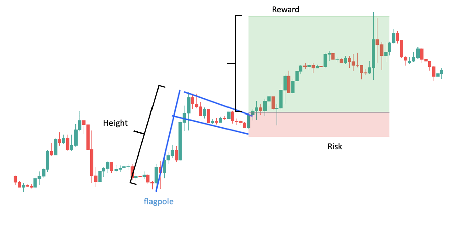
Bullish Flag
The bullish flag is a continuation pattern that you’ll often recognize around news releases. It forms when the price quickly shoots up and then begins consolidating. The advance is expected to continue after the consolidation.

How to read the pattern:
The first part of the pattern is the flagpole, which is a huge advance that breaks through a previous resistance level.
This huge advance is usually triggered by a news event. If you go to ForexFactory and take a look at the economic calendar, the events marked “red” are the most likely ones to cause similar moves.
Following the advance, the price goes through a consolidation phase that looks like a flag – hence, the name of the pattern. The flag consists of two parallel trendlines that point slightly down and retraces a small portion of the trend.
Note that if the retracement is too substantial, the flag is invalidated, as a reversal becomes increasingly likely.
When the price breaks out from the flag to the upside, the pattern is finished. This indicates that the market is about to make another impulse move in the trend direction.
Below, you’ll see an example:
Bearish Flag
The bearish flag is a continuation pattern just like its bullish counterpart. It forms when the price tumbles and then embarks on a modest rise. The selloff is expected to continue after the consolidation.

How to read the pattern:
A bearish flag pattern has the same components as its bullish counterpart. However, everything points in the opposite direction. The market experiences a negative surprise shock, which results in a sharp decline. This is the flagpole.
Following this decline, the price goes through a consolidation phase consisting of two parallel trendlines that point slightly upward. This is the flag itself.
The flag must retrace only a small portion of the trend, as an extended consolidation might lead to a reversal. The pattern is finished when the price breaks out from the flag to the downside.
An example of the bearish flag:
Warning: Flag patterns can be quite dangerous due to the heightened volatility. Plus, they tend to be paired with unfavorable market conditions: slippage and wide spreads. Be very cautious if you decide to trade them.
We wouldn’t blame you if flag patterns piqued your interest. In this case, our dedicated flag pattern guide is the ideal place to advance your knowledge.
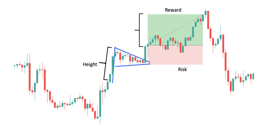
Bullish Pennant
The bullish pennant looks like a short triangle bounded by two converging trend lines. It occurs in advancing markets and hints at a price move in the direction of the prior trend leg.

How to read the pattern:
Pennants are pretty similar to flags in their structure.
They, too, are preceded by a strong upward move resembling a flagpole.
After the upward move, buyers pause to catch their breath and the market begins consolidating. This is where the difference lies between the two patterns.
In the case of bullish pennants, the consolidation phase shows a less intensive effort to reverse the trend.
Remember that flags usually form in high-volatility situations such as news releases. Traders often overreact to positive news; thus, the price jump is quickly met with aggressive short selling.
The great thing with pennants – at least from our experience – is that you can often catch the breakout from the pattern. This is because, from the higher chart perspective, the pennant is often a simple impulse move toward the trend.
Unfortunately, the drawback is that trading pennants can be quite frustrating. You’ll often catch the breakout, ride the impulse move, and see your profits melt away as the higher timeframe enters consolidation.
When you trade flags, you will be less likely to catch the breakout. That said, if you do catch it, you can often capture the entire rally that comes.
At the end of the day, trade the patterns that you feel most comfortable with.
An example of the bullish pennant:
Bearish Pennant
The bearish pennant is also characterized by a triangle-like appearance and two converging trend lines. However, unlike its bullish version, it occurs in declining markets and suggests further weakness.

How to read the pattern:
The discussion of the bullish pennant also applies to the bearish version.
After a sharp decrease, the price moves sideways in a narrowing price range resembling a triangular flag. When the price breaks out to the downside, you can expect the continuation of the trend.
Note that despite halting the market fall, buyers aren’t very aggressive. The bearish flag, for instance, has a more intense consolidation where buyers substantially push up the price.
When looking at the bearish pennant, you can feel the accumulating selling pressure. Often there’s a sudden breakout and you have to act quickly to capture the subsequent move.
An example:
Thinking about trading pennants? Wait until you’ve finished reading our pennant pattern guide. You will learn a few things this article doesn’t cover.
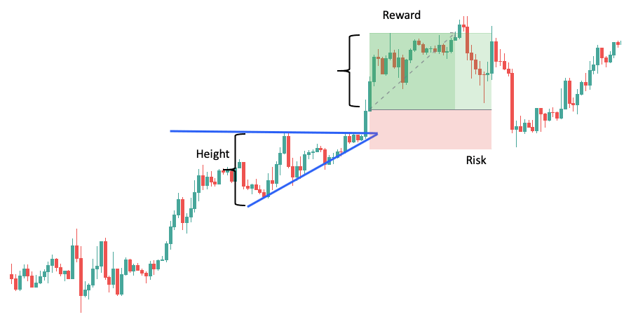
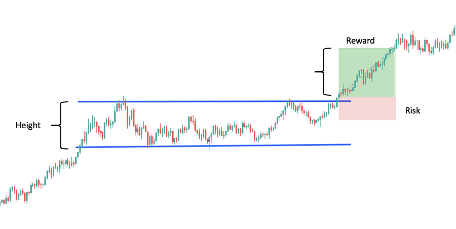
Ascending Triangle
The ascending triangle is a bullish formation consisting of a horizontal top and an up-sloping bottom. It forms when the uptrend is struggling with resistance but eventually breaks through, suggesting continuation.

How to read the pattern:
From time to time, each uptrend reaches an area where the selling pressure overcomes demand. Perhaps the price is near the yearly high and traders begin taking profits. Or perhaps a large hedge fund decided to reduce its holdings.
For whatever reason, the price bumps into resistance and starts declining. The decline is quickly met by increased demand as buyers view the lower price as a steal.
The renewed buying pressure reverses the decline, and the price climbs back to the same level. At this higher price, however, more traders become willing to sell, forcing it down again. This situation repeats itself for some time.
You might notice that each fall stops at a higher low. Buyers gain more control as the price runs up to the resistance level and, eventually, a breakout occurs. This is expected to be followed by a significant increase in price.
Ascending triangle set-ups occur frequently. An example is shown below:
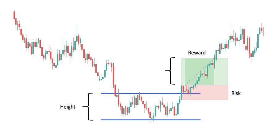
Descending Triangle
The descending triangle is just the bearish equivalent of the ascending triangle. It consists of a horizontal trend line drawn across the lows and an up-sloping trend line connecting the highs.

How to read the pattern:
This structure is created during a consolidation in a downward trend.
Strong sellers are pushing down the price while weaker buyers are trying to reverse the trend.
Imagine that many traders believe the GBP/USD exchange rate should be around 1.30. Prices much higher than that threshold are overvalued and prices much lower are undervalued.
If the current price is higher than 1.30, these traders might wait until it falls to 1.30 and then go long.
The sudden demand at the 1.30 level will establish temporary support and cause the price to rise. Nevertheless, if sellers are strong, the increase will quickly be suppressed and the price will fall back to the support.
This is what happens in the case of the descending triangle. Once the price has fallen back to support, buyers push it higher again just to see it tumble shortly after.
By looking at the pattern, you can see that every attempt to lift the price is stopped at a lower high. This is a great indication of waning enthusiasm and growing selling pressure.
The price is pushing into the support until it fails to hold, which marks the completion of the pattern.
Below, you’ll find an example:
Those who like tinkering with trading strategies might be interested in our attempt to build a triangle trading strategy from scratch. Spoiler alert! The backtest result shows a profit of +10.48% in only three months.
Bullish Rectangle
Rectangles are very versatile patterns that occur when the price is bouncing between two parallel support and resistance levels.

You must pay close attention to these patterns because you never know if they will be bullish or bearish until the breakout.
Bullish rectangles occur when the breakout is to the upside. This signals continuation if the trend is up and reversal if the trend is down.
Don’t worry, we’ll explain.
How to read the pattern (in an uptrend):
Markets are driven by buyers and sellers.
When the price has been increasing for a while, the people who bought the currency pair at the beginning of the trend will eventually begin taking profits.
This will create an increased supply at a particular level, as these people must sell their position to reap the returns. This selling creates the resistance level that you can see at the top of the bullish rectangle.
Once selling sends the market down, other traders will take it as an opportunity to buy at a cheaper price. This means a higher demand at a particular level. Consequently, a support level emerges, forming the bottom of the rectangle.
Now the market is stuck between these two levels: support at the bottom and resistance at the top.
Sellers who think the trend is over will stop the price from moving above the resistance. Similarly, buyers who think there’s still room for an increase will stop it from falling below support.
When a breakout occurs to the upside, the market tells you that the profit-taking is done and short-sellers were unable to hold the resistance. The odds now shift in favor of trend continuation. This is what the bullish rectangle signals in an uptrend.
Below is a trade set-ups to illustrate:
How to read the pattern (in a downtrend):
In this case, the rectangle is preceded by a falling market, which begins consolidating upon hitting support.
The price starts bouncing between two levels: the support zone at the bottom and a newly established resistance at the top. This resistance is the hallmark of the seller’s intention to keep the market in the downtrend.
Because the trend is down, you’d expect a breakout to the downside. When the breakout happens to the upside, however, it’s a great indication of surging demand and a potential trend change.
Take a look at the example below:
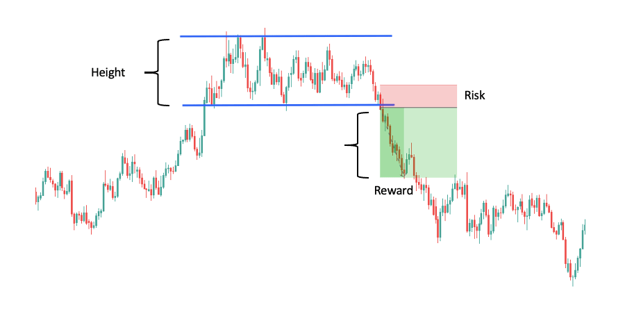
Bearish Rectangle
The bearish rectangle is identical to the bullish rectangle except that the breakout is to the downside.

Like the bullish version, it can signal both continuation and reversal. If the trend is up, the bearish rectangle acts as a reversal pattern. If the trend is down, it acts as a continuation pattern.
Let’s take a closer look at these two scenarios:
How to read the pattern (in an uptrend):
The uptrend enters a temporary sideways movement that usually appears at or near an existing resistance level that the price can’t immediately surpass.
Around this area, the power of sellers and buyers becomes nearly equal. As a result, the price moves in a tight trading range, bounded by a resistance level at the top and a support level at the bottom.
Sellers take control after some time and the pattern completes with a downside breakout. This is the distinguishing feature of the bearish rectangle pattern. Consolidation in the uptrend followed by breakout to the downside signaling the reversal of the trend.
Below is a trade set-ups to illustrate:
How to read the pattern (in a downtrend):
The price falls in a strong downtrend and then starts to consolidate between support and resistance levels.
This up-down struggle continues for a while and the pattern begins to exhibit the shape of a rectangle, from which it gets its name.
Eventually, buyers run out of ammunition. The selling overwhelms demand, and the price begins falling once again. When it breaks through the support level, the bearish rectangle is complete and signals continuation of the trend.
Take a look at the example below:
Although they are fairly simple patterns, the close similarity between the bullish and bearish rectangles can confuse new traders. Click here for a more in-depth explanation, additional examples, and interesting strategies.
Conclusion
Chart patterns are arguably one of the most popular tools of technical analysis.
However, you must make sure that you are using forex chart patterns not only to generate trades but also to turn those trades into income.
You must have a trading plan if you want to be profitable.
This guide helps you figure out how to leverage different forex chart patterns. Then, you must create your own rules regarding the risks you take, the currency pairs you trade, the timeframes you follow, and so on.
Once you know which chart patterns you like, you can perform backtesting to understand them even better and figure out the best way to trade them.
Consider the suggestions you have read in this guide and download our free forex chart patterns cheat sheet. If you do, you’ll be on your way to making the most out of chart patterns.