
Does your trading bring in an embarrassingly small amount of money?
Or do you struggle to make money even in a demo account?
The fact is, even if your trading knowledge is great, you could still be losing money by neglecting one simple thing.
The power of candlestick charting.
Charts act as a window into the psychology of people. This is especially true for the visually appealing candlestick charts.
If your knowledge on this topic is either inadequate – or missing entirely – you may not be able to understand what the market is actually telling you.
Now, don’t worry.
This guide will teach you everything you need to know about candlesticks.
How to read the candlestick chart.
Candlestick patterns.
And a cool infographic that we’ve never shared anywhere else before.
Let’s get started.
History of Candlestick Charting
This is just a brief history lesson for those who’re interested.
So, if you’d rather go straight to the point, feel free to skip this part.
Now, with the others who decided to stick with us here, let’s see what happened in Japan during the late 1500s to the middle 1700s.
Why?
Because candlestick charting originates from Japan.

In fact, it’s called Japanese candlestick charting, to be precise.
From 1500 to 1600, Japan consisted of several provinces, but there wasn’t a single unified country as it is now.
Instead, there were incessant wars between feudal lords for the control of neighboring regions.
That is, until three remarkable generals successfully unified Japan by the early 1600s.
As it usually happens in such cases, it was just one of them who eventually became the shogun and whose family ruled unified Japan from 1603-1867.
Referred to as the Tokugawa period, this was a prosperous and peaceful era that opened up several new opportunities, including a centralized marketplace for rice trading.
According to Steve Nison, author of Japanese Candlestick Charting Techniques, much of the credit for candlestick development and charting goes to a legendary rice trader named Homma who made a boatload of money using candlestick analysis.
 Although his original ideas were probably refined over the years, the trading principles he developed became the basis of modern candlestick methodology that we use today.
How to Read the Candlestick Chart
To read the candlestick chart, you must first understand how candlesticks are constructed.
Each candlestick represents a specific time frame, such as one day, and provides information on the price’s open, high, low, and close during that period.
This means that candlestick charts provide twice the information of standard line charts, but they can also be confusing if you’re new to forex.
Let’s take a look at the elements of an individual candlestick.
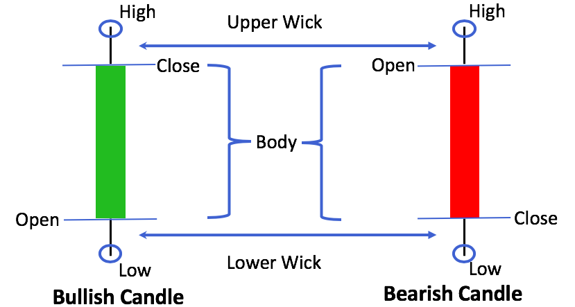
The picture above contains all the information you need to read candlestick charts confidently, so spend a few minutes studying it.
After that, simply scroll down for a detailed explanation. The following sections are organized in a logical order, so you can use them as a step-by-step guide on how to read the candlestick chart.
Learn to Differentiate between Bullish and Bearish Candles
First, there are two main types of candlesticks: bullish and bearish.
These terms are finance parlance, and you will see them a lot. In essence, a bull is a trader who is betting on a price increase, while a bear is a trader who is betting on a price decrease.
Consequently, a bullish candle represents a period of rising prices while a bearish candle represents a period of falling prices.

It is fairly easy to determine if a candle is bullish or bearish; simply look at the relationship between the open and close prices.
A bullish candle will close higher than it opened, while a bearish candle will close lower than it opened.
To make it easier for you to differentiate between bullish and bearish candles, their bodies are colored differently.
And this brings us to the next point…
Learn to Recognize the Body
The distance between the open and close is joined by a box, which is referred to as the body of the candle.
The default body color of a bullish candlestick is usually green (or black in some software), while the body of a bearish candlestick is usually red (or white).
A green body depicts an up‐day when buyers are victorious over sellers, while a red body depicts a down‐day when sellers are victorious. The length of the body measures the strength of the move.
Grasp the Concept of Wicks (AKA shadows)
The wicks represent price movements that occurred outside the body. These are the prices that the market reached but did not maintain during the period.
The line above the body is called the upper wick, while the line below the body is called the lower wick.
Consequently, the high and low points of the candle are simply marked by the peak of the upper wick and the bottom of the lower wick.
Wicks can provide important clues about the state of the market.
For instance, a long upper wick indicates that while buyers significantly bid up the price, it was almost entirely pushed back by the end of the period, which could indicate a weakening trend.
Consider How Multiple Candlesticks Interact with Each Other
Now that you know how to read a candlestick, you can read a candlestick chart, as it is simply a historical record of individual candles.
For example, a 1-hour candlestick chart is simply made up of 1-hour candlesticks chained together in chronological order for the past few weeks.
To better understand how candlesticks work and how candlestick charts are constructed, let’s take a funny example.
Let’s assume you want to draw your own candlestick chart.
Starting at 1:00 PM, every 15 minutes, you check the EUR/USD price on Google. You also make a sketch every time you check the price.
At the end of each hour, you simply cut out the last sketch from your sketchbook and stick it onto a large chart.
This is what you have in your sketchbook one hour after starting this exercise.
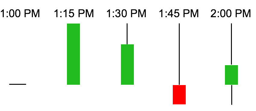
And here’s the explanation:
- 1:00 PM: The candle opens, but at this time, the opening price and the current price are identical, so the candle doesn’t have a body.
- 1:15 PM: During that 15 minutes you weren’t looking, buyers pushed the price way higher than the opening, so at this moment, the candle is bullish.
- 1:30 PM: Sellers jumped in at full speed and managed to push back the price a little. Now, the candle has an upper wick, but it’s still bullish, as the price is still above the candle’s opening.
- 1:45 PM: As it turns out, sellers are pretty strong. Now, the candle has become a bearish candle, as sellers pushed the price below the candle’s opening.
- 2:00 PM: Buyers took a deep breath and led the final attack on sellers. They not only pushed back the price to the candle’s opening but went even further. The candle eventually closed as a bullish candle.
Now an hour passed; you simply take the 2 PM candle and put it on the chart.
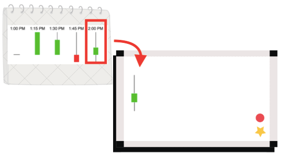
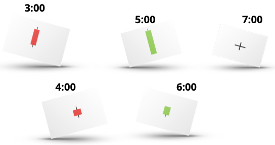
Then you continue. Let’s assume these are the next few candles you cut out from the sketchbook:
Of course, you are smart, so you recognize that if you want prices to flow smoothly and make sense, you cannot simply tape your candles all over the chart.
You must consider candles in order of time, so the 2 PM candle goes first. This is followed by the 3 PM candle, the 4 PM candle, and so forth. Also, the closing price of one candle must be the opening price of the next candle.
So, here’s what your chart looks like:
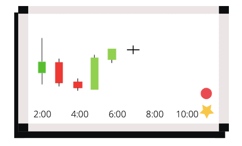
In essence, this is how candlestick charts are built.
Obviously, people nowadays rely less on their drawing skills and more on computers. But we hope this example helped you understand how to read the candlestick chart.
Candlestick Patterns Explained
A candlestick pattern is a single candlestick or a combination of candlesticks that offers a quick insight into the recent trading psychology.
You’ll notice something surprising right away:
When it comes to the names of different patterns, there’re frequent analogies to trading the market and fighting a battle.
For example, after hearing an expression such as “hanging man,” would you think the market is in a good state?
Probably not.
This terminology makes sense if you think about it:
There’s a never-ending battle between buyers and sellers.
When a candlestick closes, you’ll see whether the candle is bullish or bearish, depending on which party was stronger during that period.
In the same way, when a candlestick pattern emerges, it can be also bullish or bearish.
When you see a bullish candlestick pattern in a downtrend, it functions as a reversal candlestick pattern that signals the end of the current trend.
The same thing goes for a bearish candlestick pattern in an uptrend.
Now here’s a twist:
Most bullish and bearish patterns can also act as a continuation pattern if they appear in their own trend (for example, a bullish pattern in an uptrend).
Nevertheless, traders tend to concentrate on reversal signals.
Now, you need to understand this one:
Trend reversals don’t happen overnight.
Instead, they usually occur slowly, in stages, as the market psychology shifts.
Considering this, reversal candlestick patterns act like a car’s red brake lights.

They show us the forward movement (trend) is about to end, but it doesn’t mean the driver will put the car in reverse.
Hope you get the idea.
The point is you need to keep an eye out for more clues to confirm a potential reversal. For example, you may decide to use a technical indicator.
In addition to bullish and bearish patterns, there are also indecision patterns.
No worries, it’s not rocket science.
These are simply single-candle patterns whose opening and closing prices are the same or nearly identical.
Now, the cool thing is that indecision will rarely maintain any trend.
This means that indecision candlesticks are SUPER powerful in catching market tops and bottoms.
Okay, let’s move on.
Top Forex Candlestick Patterns
If you’re looking for some practical candlestick patterns you can use for your Forex trading, you’ll love this infographic.
It’s a simple list of the most reliable patterns that can help you make more money out of the market:

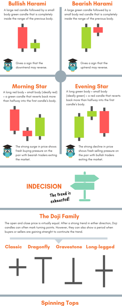
Here’s Our Notes on the Candlestick Pattern Infographic:
1. Forex and Non-Forex Patterns.
When it comes to Forex candlestick patterns, you will see that some of them look slightly differently from those you can find in most candle books.
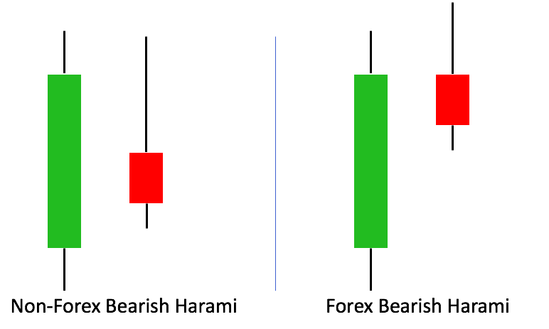
It’s because these are mainly written for trading in the stock market and they incorporate gaps by definition.
A gap is a blank space between prices that tends to occur between the close of the market on one day and the next day’s opening.
(This is due to a huge buying or selling interest that developed overnight.)
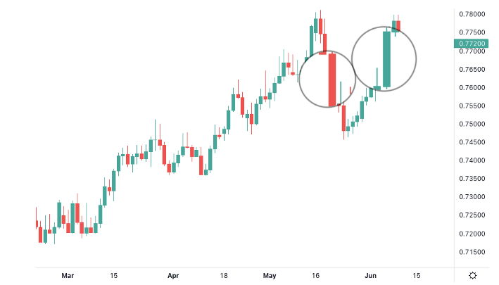
Just take a look at Amazon’s chart we took from Investing.com:
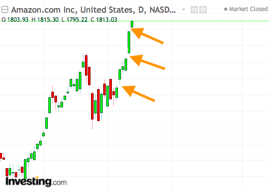
Because of the 24-hour nature of the Forex market, you will rarely see gaps while trading currencies.
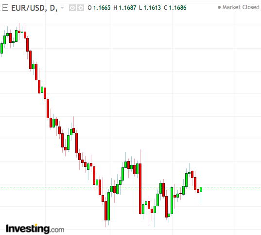
The occasional Forex gaps almost always take place when the market opens on Sundays.
TradingHeroes has a great article about Forex gap trading; make sure you check it out.
2. Marubozu Patterns
A Marubozu candlestick clearly shows the market sentiment; therefore, it can be exceptionally useful in situations such as breakouts or reversals.
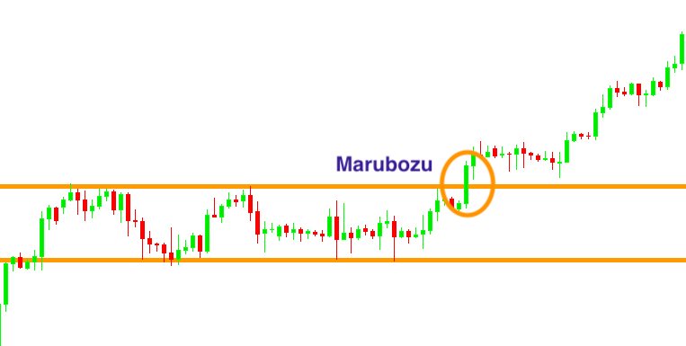
The longer the candle is, the more intense the buying or selling power.
Fun fact: The word “marubozu” means something similar to bald or shaven head in Japanese, which makes sense taken the shape of the pattern.
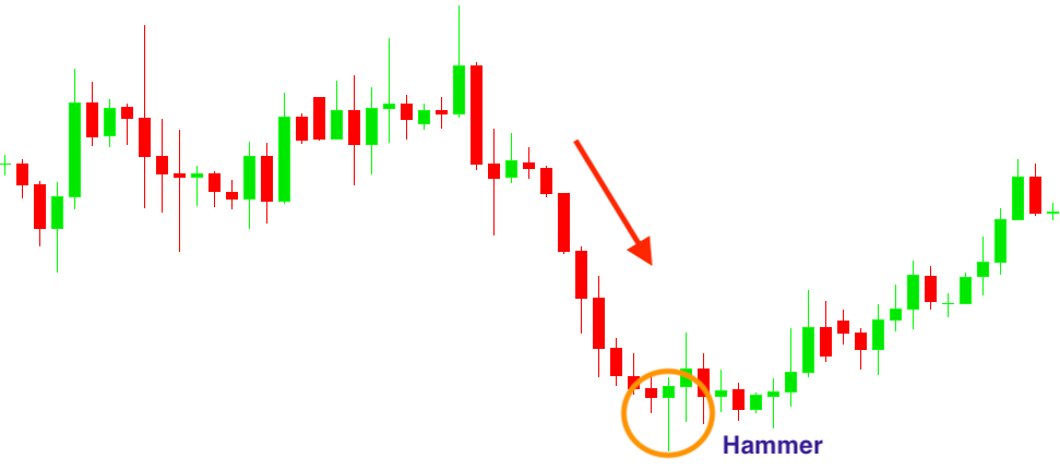
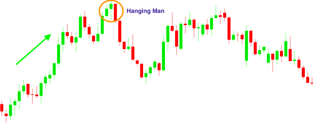
3. Hammer and Hanging Man Patterns
Both patterns’ bodies must be at least half the length of the wick, but smaller, such as 1/3 of the wick, is even better.
The color of the candles doesn’t matter; you only need to look at the preceding trend to know whether it’s a hammer or hanging man.
Generally, a hammer pattern gives its best signal when it appears after three or more consecutive bearish candles.
On the other hand, a hanging man pattern is the most reliable when it emerges after a series of bullish candles.
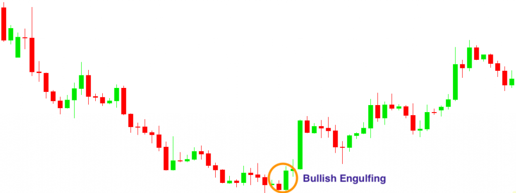
4. Engulfing Patterns
A bullish engulfing commonly appears when there is a bottom after a downtrend.
Conversely, a bearish engulfing tends to occur when the market hits a top in an uptrend.
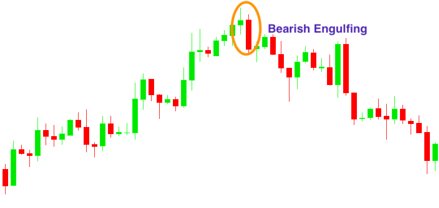
An engulfing type reversal is somewhat stronger than a hammer or hanging man reversal, because it indicates a real buying/selling hysteria that can easily spill over to the next candle.
5. Harami Patterns
Harami patterns are the reverse of the engulfing patterns.
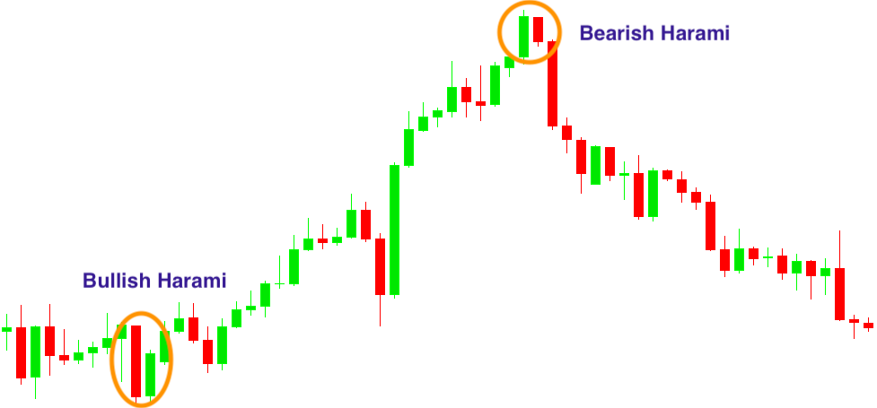
It’s important that to be a valid pattern, the second candle should close above half the first candle’s body.
Although they are considered to be reversal patterns, a bullish or bearish harami is a somewhat less significant reversal signal than the hammer, hanging man, or engulfing patterns.
6. Morning Star and Evening Star Patterns
When you see a Morning Star, take it as an early indication that the downtrend is about to reverse.
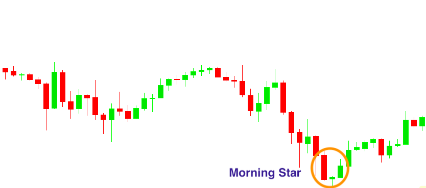
According to Nison, its name is derived because, like the morning star (the planet Mercury) that foretells the sunrise, it presages higher prices.
The Evening Star is the bearish counterpart of the Morning Star pattern.
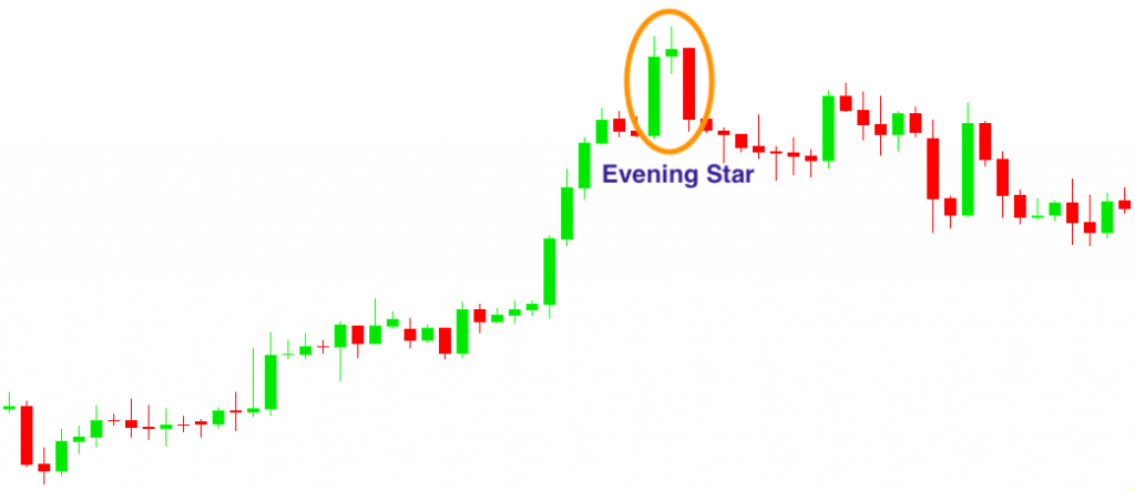
Just like the evening star (the planet Venus) appears before darkness sets in, the corresponding candlestick pattern signals the end of an uptrend.
7. Doji Candlestick Patterns
A Doji is a candle whose open and close prices are nearly equal; therefore, it suggests indecision.
Depending on the length of its wicks, there are 4 different Doji candlestick patterns.
The Classic Doji has a tiny upper and lower wick.
The Long-Legged Doji has a long upper and lower wick that are almost equal in length.
Hint: It shows that traders are becoming more active and some serious price move may come.
The Dragonfly Doji appears when the Doji has a very long lower wick.
The Gravestone Doji appears when the Doji has a very long upper wick.
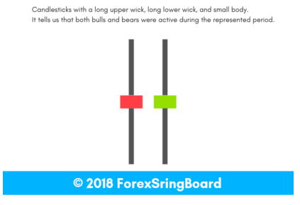
8. Spinning Top Patterns
Think about the tiny toy that was the inspiration for the naming of the pattern.
If spun fast enough, it will rise to a vertical position and stay there until an external force affects it, such as gravity or someone touching it.
When it is spinning smoothly, you don’t know when it will fall or which way it will point.
Something similar happens in Forex.
The buyers sent the price sharply higher and the sellers sent the price sharply lower, but eventually, the candle closed near its opening.
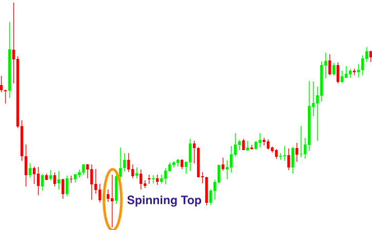
Obviously, we can’t know how many traders are sitting on the sidelines about to buy or sell.
So, when you see a spinning top, be aware that it can be a sign of an upcoming reversal.
Do Candlestick Charting Techniques Really Work?
In short: Yes, they do.
However, they’re not magical.
Those who’re looking to find the magic pill will be disappointed with candlestick charting techniques.
In fact, they will be disappointed with trading in general.
There’s no technique, pattern or a single method that works at all times.
Instead, you need a combination of techniques that meets your SPECIFIC needs.
The best way you can use candlestick patterns is as an augmentation to your overall analysis.
Let’s take a simple example.
You’ve spotted a hammer in a downtrend.
Now what?
If you go and buy that currency pair right away, that’s a HUGE mistake.
However, if you see that the hammer is printed on a support level, the RSI indicator gives a buy signal the higher timeframe is bullish, etc.
Then, you can consider buying.
Hope you get the idea.